
Soft Solutions Redesign: From Light SaaS Template to Dark Developer Brand
Project Gallery
Walkthrough
Why touch something that worked
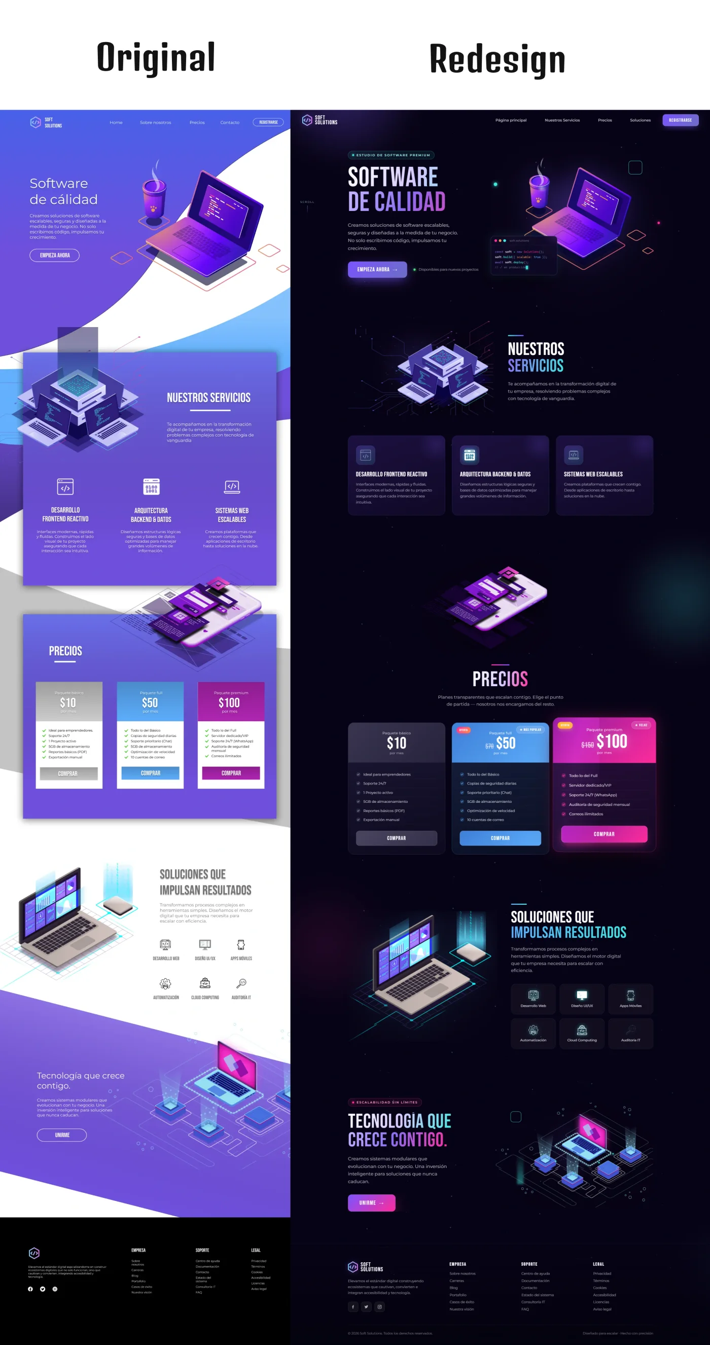
I designed the earlier version of this page myself, and it did its job. Pale purple, isometric illustrations, a friendly tone. You can see it in the original case study.
The trouble showed up later, once the client started selling against bigger names. Their buyers are engineering leads. That audience spends its day inside a terminal and a code editor, and a bright, approachable page reads to them as a product built for someone else. The visuals were saying approachable startup while the sales conversation was saying serious infrastructure.
Nothing was broken. The positioning had simply moved past the design, which happens to most companies within a couple of years and is rarely diagnosed as a design issue at all.
What actually changed
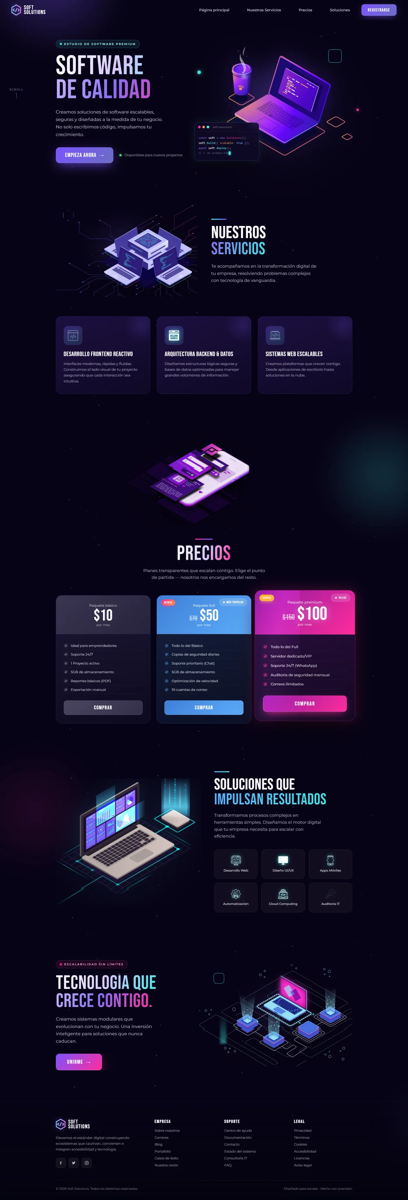
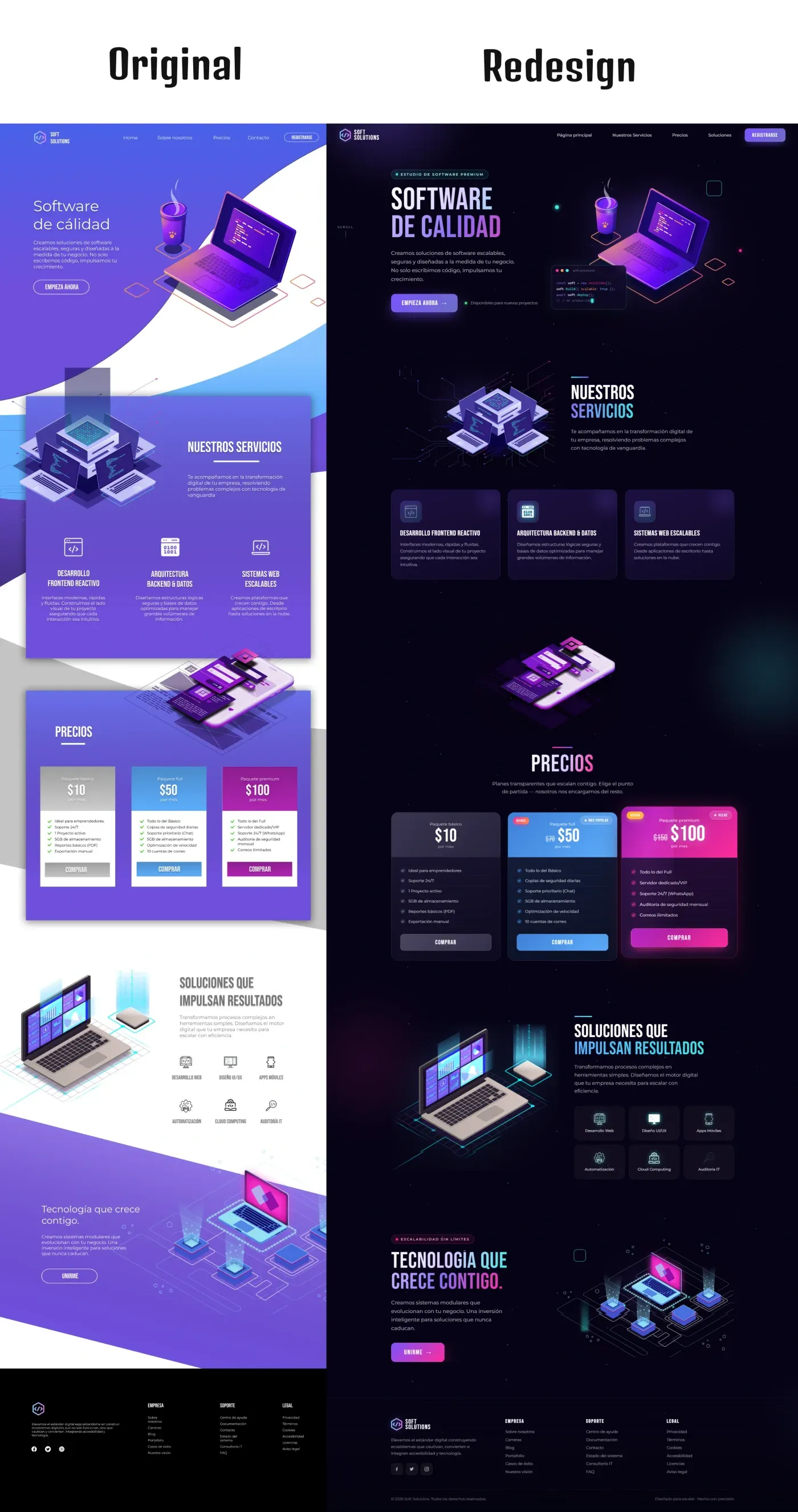
Palette. Pale lilac gradients gave way to near-black with cyan and magenta used sparingly. Those two hues carry a specific association for this audience, since they are what syntax highlighting looks like. The reference does the positioning quietly, without a line of copy claiming technical credibility.
Type. The previous sans-serif was neutral to the point of anonymity. Condensed display faces with a gradient fill replaced it in the headings, which gives the page a voice at a glance. Body copy stayed unfussy, because contrast only works if one side stays calm.
Hero. The illustration alone asked visitors to imagine the product. Adding a code editor mockup beside it, plus visible trust badges, means someone landing cold sees what they would be working with in the first second rather than the third scroll.
Cards. Flat colour blocks turned into glass panels with defined borders and icon badges. Beyond the surface treatment, borders solve a real legibility problem: on a dark background, sections without edges bleed into each other and the eye loses track of where one idea stops.
Pricing. The old table listed facts. The rebuilt block is designed to be compared, with the tiers weighted differently and discounts marked where they exist. People do not read pricing, they scan it looking for the one that fits them.
Working in dark mode without losing legibility
Dark interfaces fail in a predictable way: designers reach for pure white text on pure black, and the contrast becomes so harsh it fatigues the eye within a paragraph.
I kept body copy slightly off-white and reserved full-intensity neon for elements that need to be found rather than read, buttons, badges, active states. Every combination was checked against WCAG contrast thresholds, since dark palettes fail those more often than pale ones and the failure is easy to miss when you are looking at your own screen in a dim room.
Tools
- Figma for the interface, with dark-mode colour tokens and component variants so every state was defined rather than improvised
- Adobe Illustrator for the isometric vector pieces
- Inkscape for supporting assets
Building it as tokens rather than fixed values matters here. A palette this specific falls apart the moment someone adds a section using an approximate colour, and tokens make the correct value the easiest one to reach for.
What it produced
A page whose visual language matches the technical seriousness of what the company sells, and a component library the team can extend without the design drifting.
Is your site describing an older version of your company?
Positioning moves faster than design does. When the two stop matching, the site quietly undersells the business, and it usually goes unnoticed because nothing appears broken.