
Soft Solutions Case Study: UI/UX Design & Branding for Tech Agency Website
Project Gallery
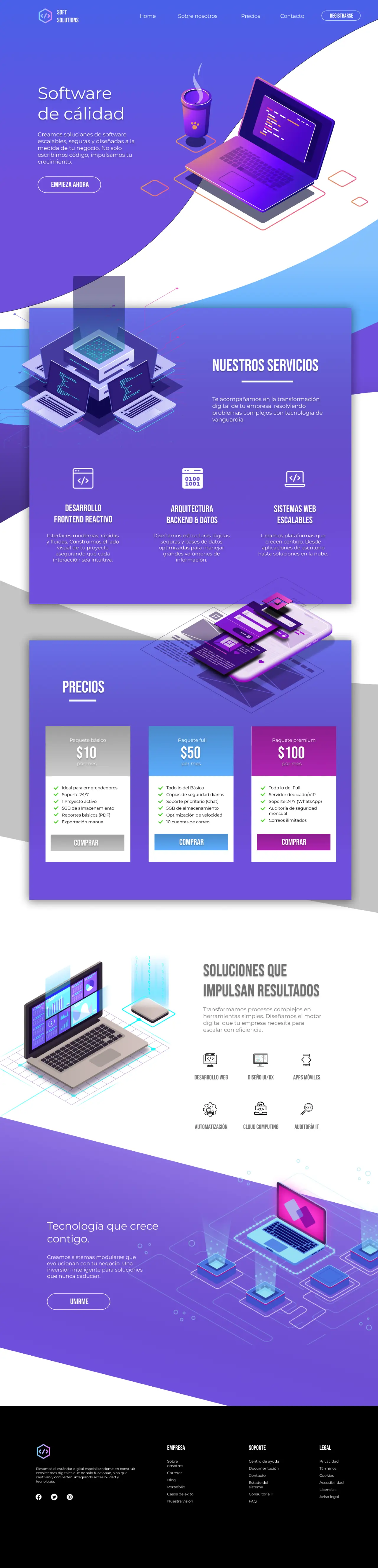
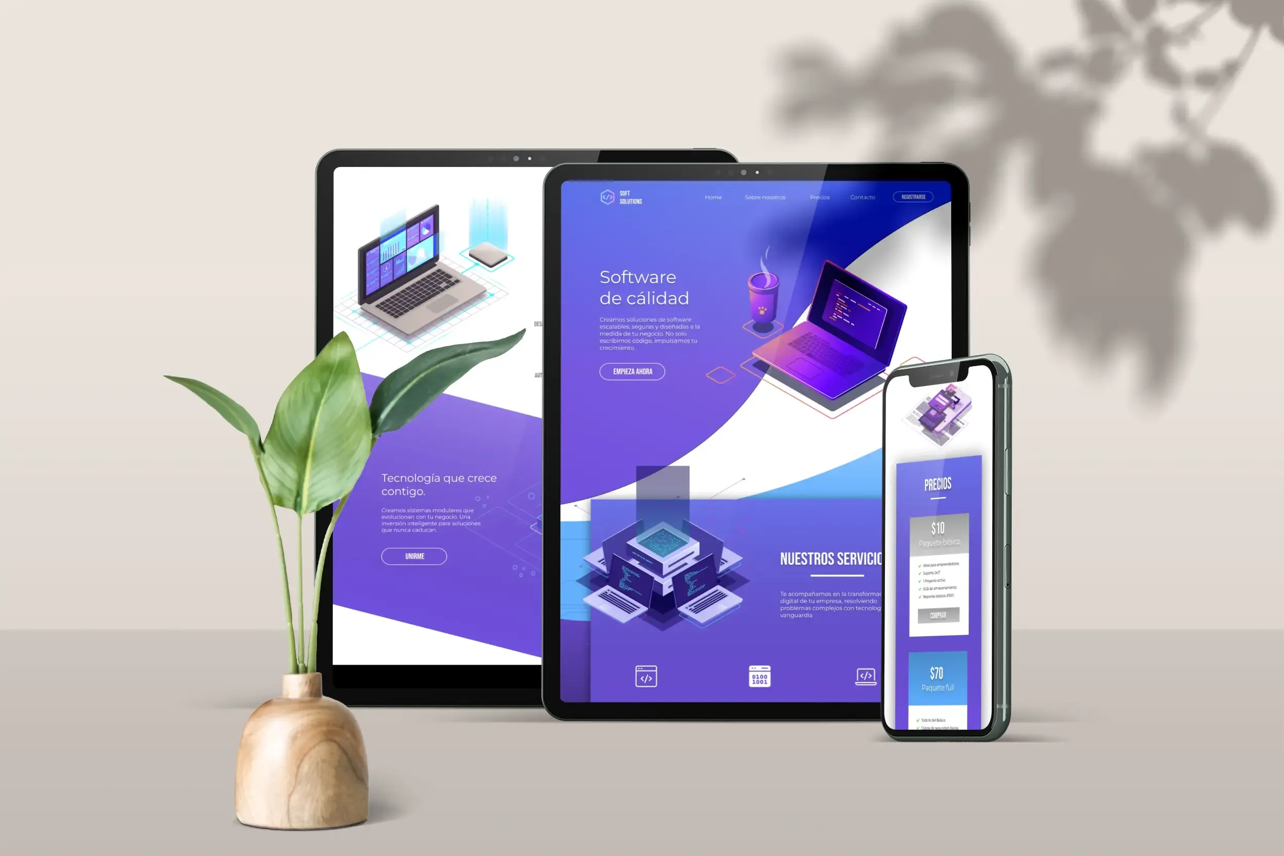
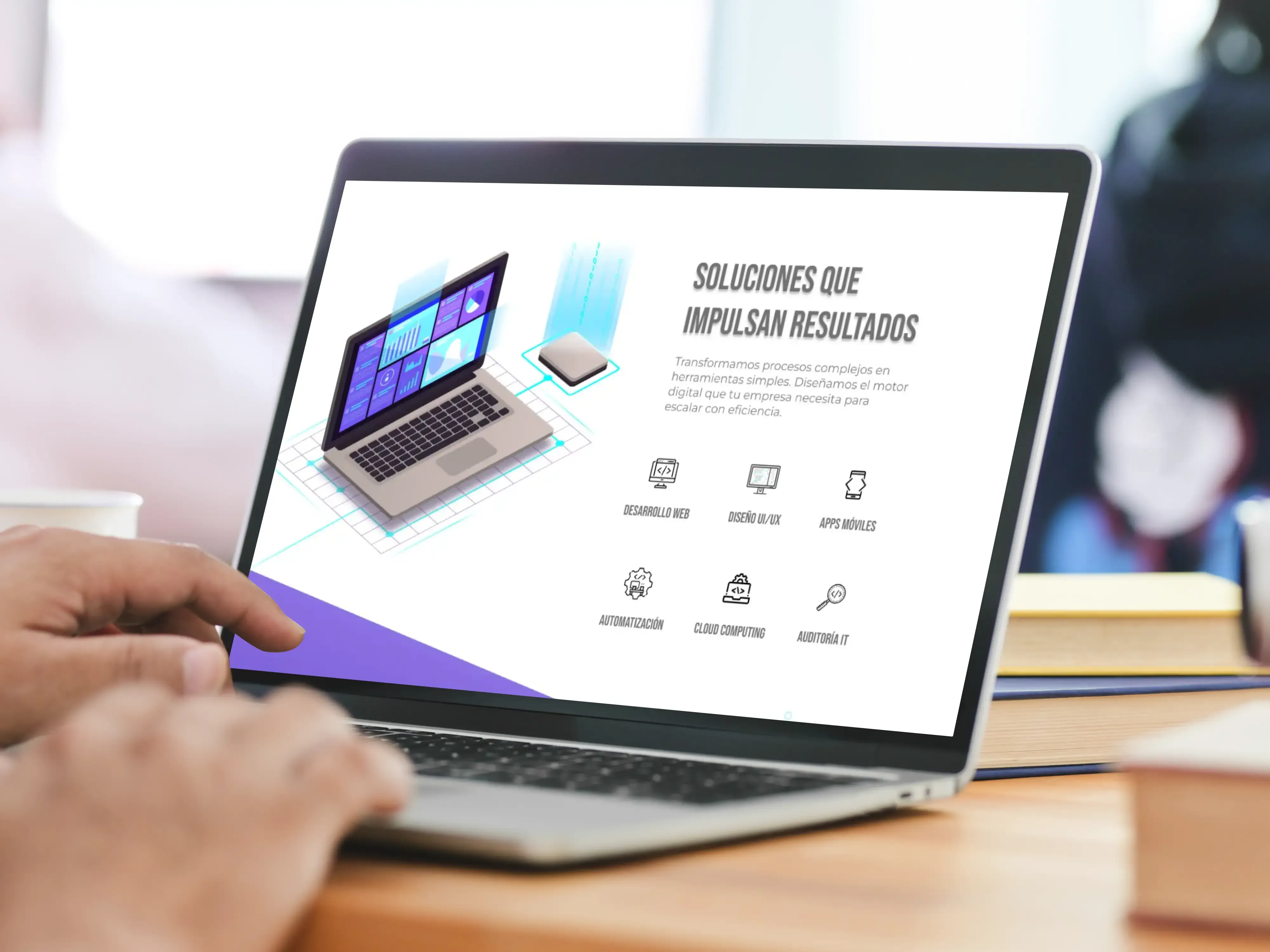
The problem with selling software
Soft Solutions sells backend architecture and scalable systems. Nobody can picture that. Their previous site described the work in words, and the words were accurate and completely inert: prospects arrived, read “scalable infrastructure”, and left no closer to understanding what they would be buying.
The brief asked for vector illustrations. The actual job was making an invisible product legible.
Why isometric
I chose an isometric system rather than flat illustration or 3D renders, for reasons that were practical before they were aesthetic.
Isometric projection gives you depth and spatial relationships without perspective distortion, which means a system diagram reads as a structure rather than a picture. Someone looking at it can see that this component sits on top of that one. Flat illustration loses that; real 3D renders get it back but cost far more in file weight and production time for the same clarity.
Being vector, the illustrations stay sharp at any size and weigh a fraction of a raster equivalent. For an agency whose pitch is technical competence, a slow site would have undercut the message.
The geometric system
The agency describes itself as both rigorous and creative, which is the kind of claim that usually stays as a claim. I built the visual language to demonstrate it instead:
Squares carry the logic. Pricing tables, technical specifications and comparison blocks sit in strict rectangular structures with hard alignment. Stability where the reader needs to compare numbers.
Circles carry the movement. Rounded shapes and circular accents sit around the illustrations and guide the eye toward the calls to action. Motion where the reader needs to be led.
Keeping those two vocabularies separate means each section signals what kind of attention it wants before anyone reads a word.
Spacing as a technical decision
Detailed illustrations need room or they turn into clutter. I set the grid in Figma with deliberately generous gutters, then held that rhythm across every section. The illustrations get isolation; the reader gets a resting point between dense blocks.
Tools
- Figma for the interface, the grid system and the component library
- Adobe Illustrator for the isometric vector assets
The layout was specified with a static site build in mind, so the illustration weight would not compromise load time in production.
Result
The agency ended up with a page that explains its offering visually rather than asking prospects to take the description on faith, and an illustration system it can extend as new services are added.
Explaining something abstract?
Technical products often fail online because the value is invisible, not because the copy is weak. If that describes your site, get in touch.