
Car Rental Website Design with Elementor & Turo Integration
Project Gallery
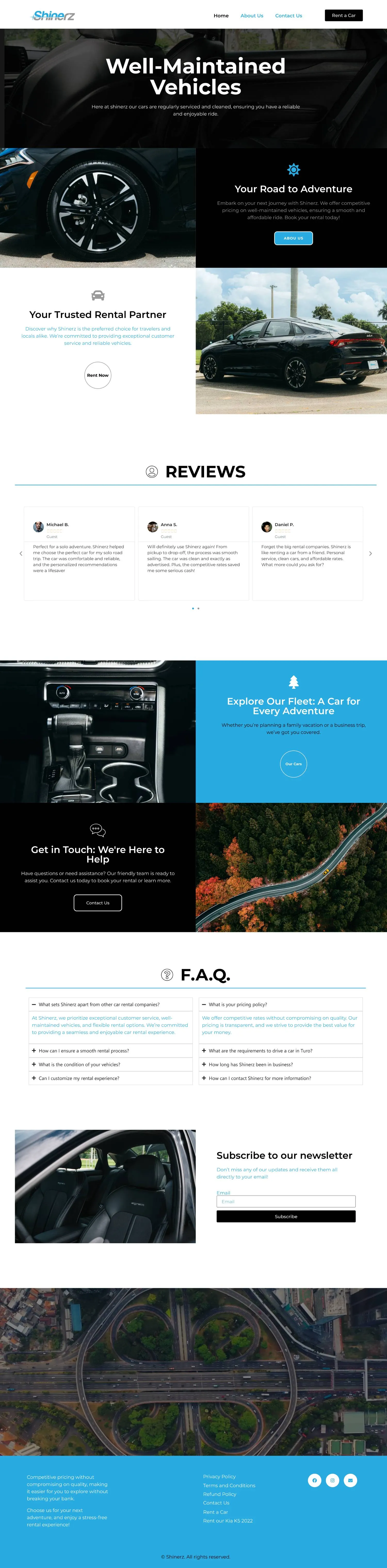
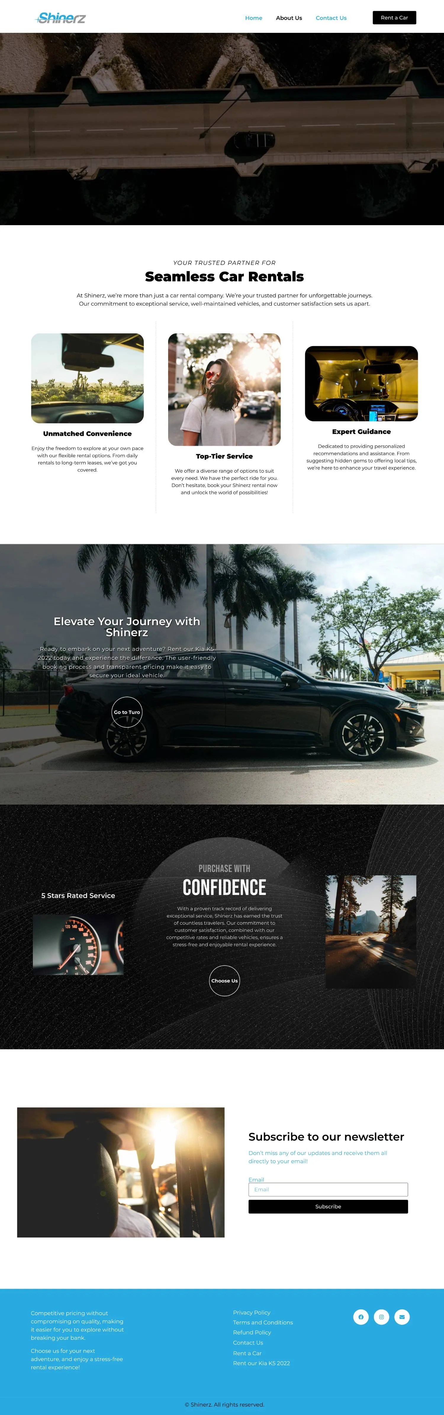
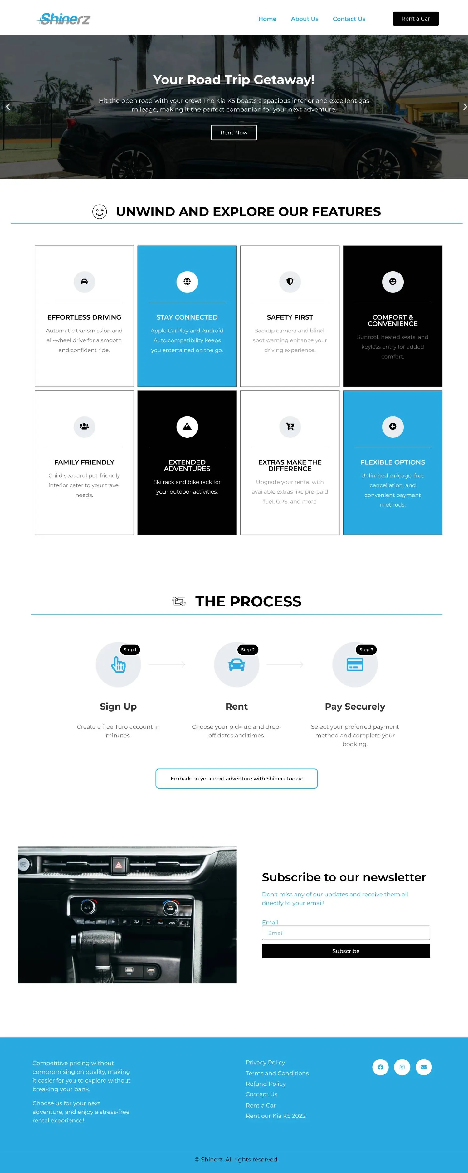
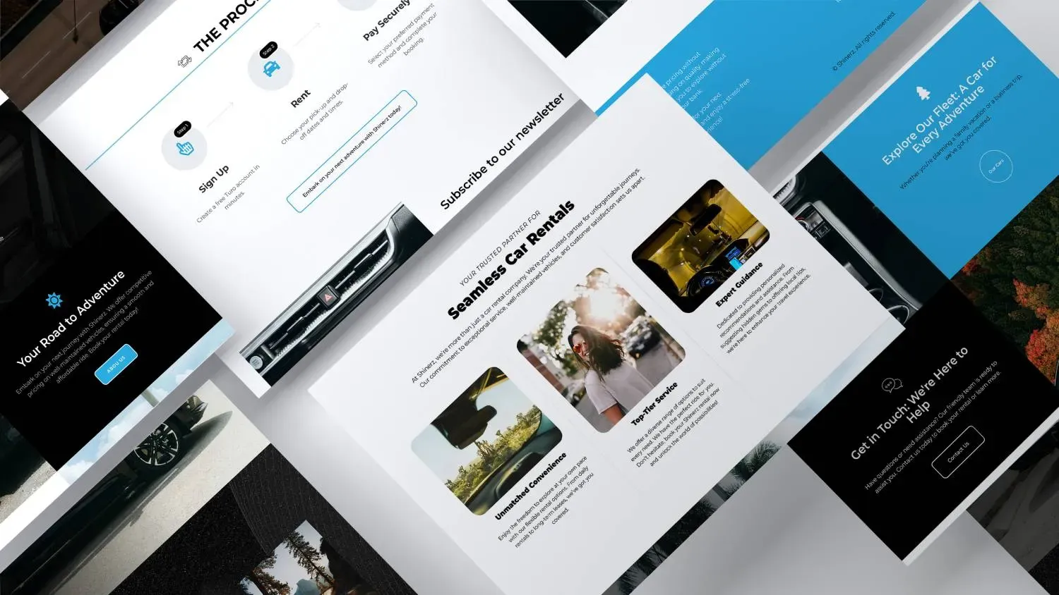
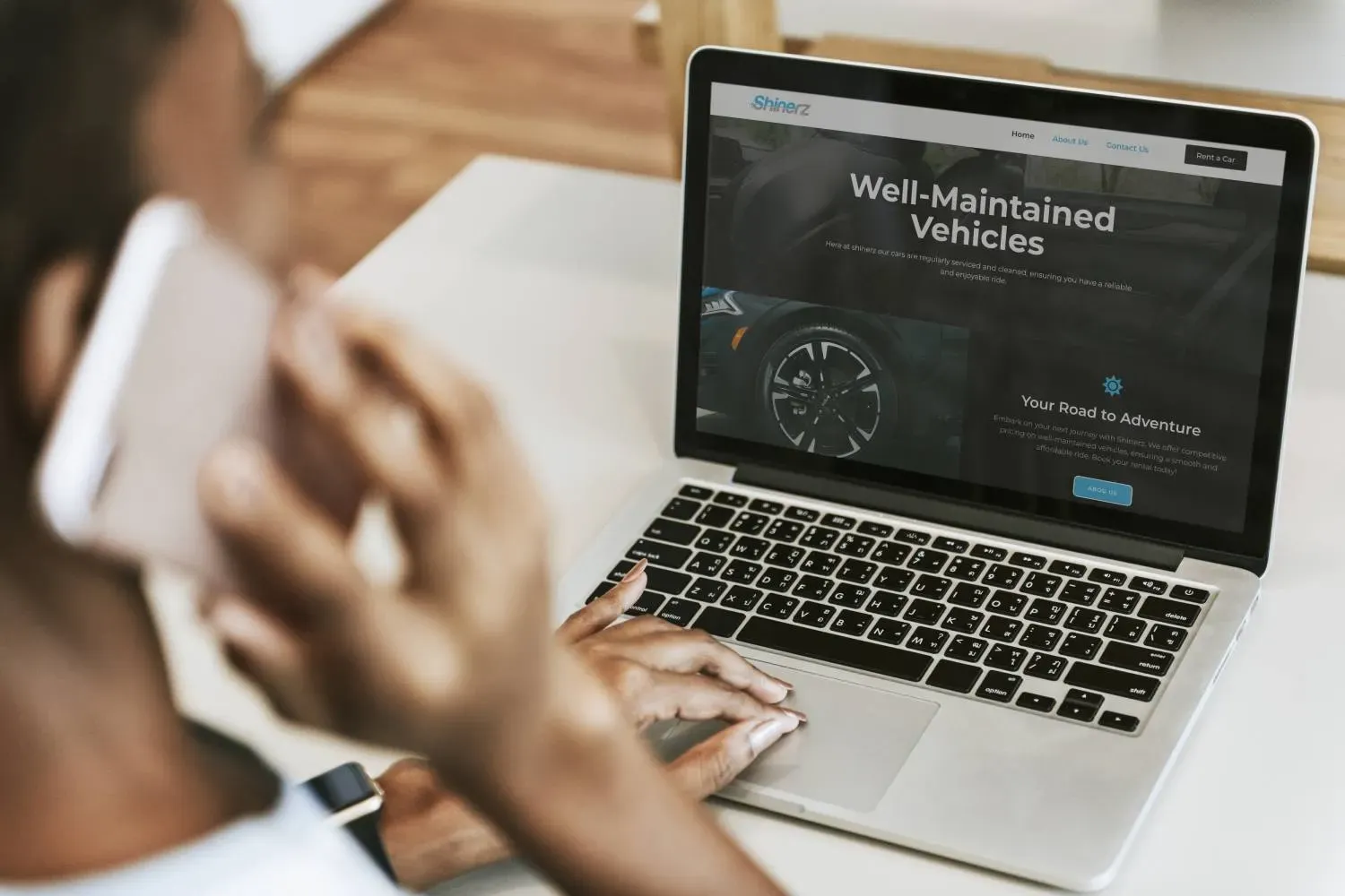
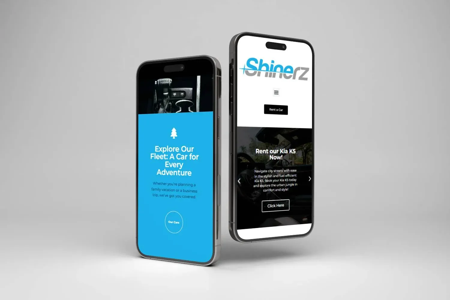
The decision that shaped everything
Shinerz rents cars through Turo. The obvious move was building a booking system on their own site. I argued against it, and that shaped the whole project.
Turo already carries the insurance framework, the verified reviews and the payment infrastructure. Rebuilding those on a WordPress site would have meant months of work to produce something a renter trusts less than the marketplace they already know. Handing the transaction to Turo and using the site for everything Turo cannot do was the better trade.
So the site’s job is brand and desire. Turo’s job is the transaction.
Making the handoff invisible
The risk with sending someone to an external platform is losing them in the gap. Three things address that:
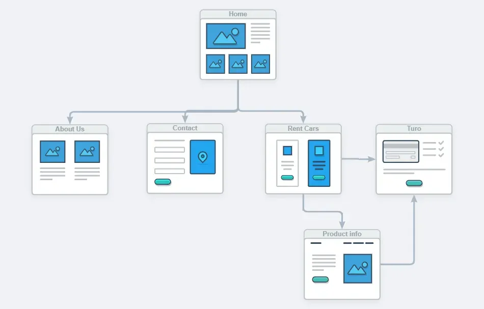
The catalogue does the qualifying. By the time someone taps through to Turo, they have already chosen a specific vehicle. They arrive at a decision, not at a search.
One action per vehicle. No competing calls to action that scatter attention before the handoff.
Depth before the exit. Each car has its own detail section, so the choosing happens on the site where the brand can influence it, rather than in Turo’s generic listing view.
Architecture
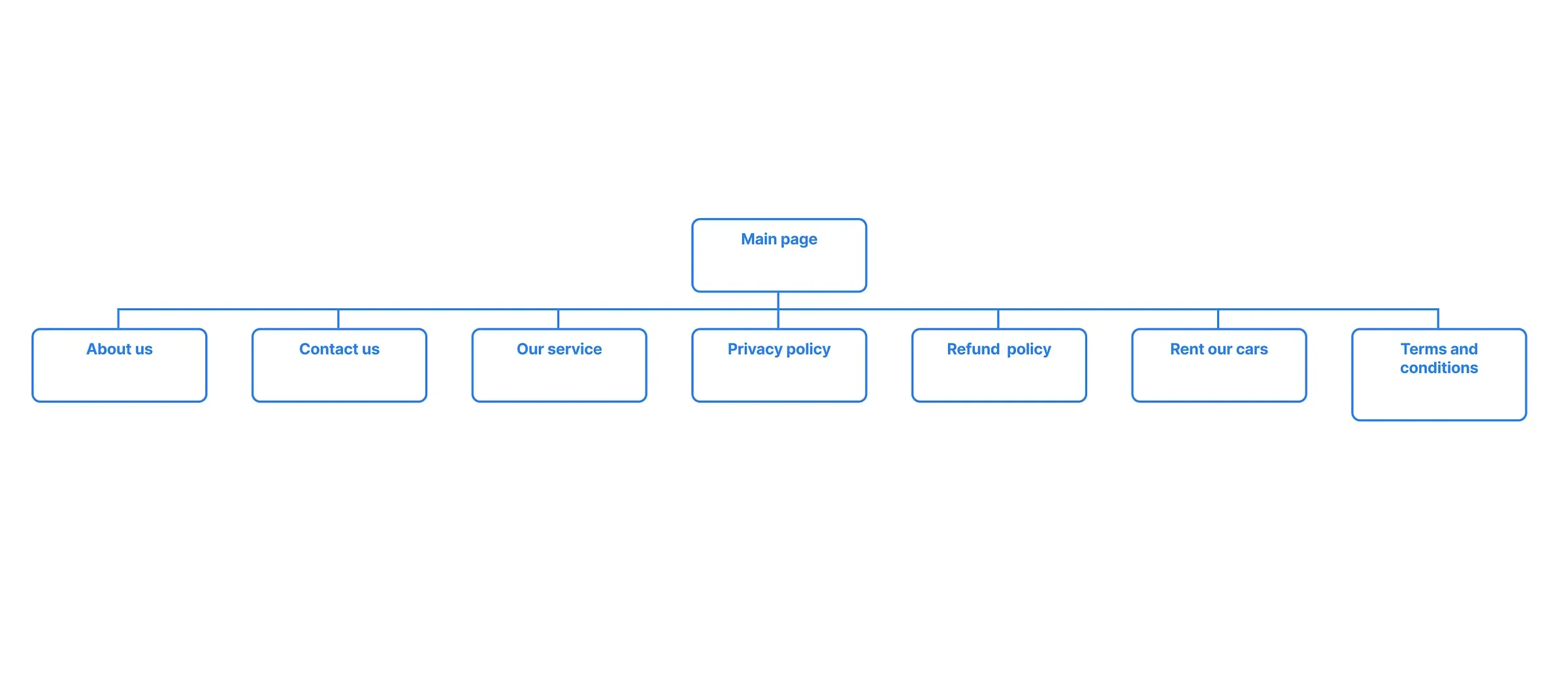
The sitemap is deliberately shallow. Home, fleet, service pages, and the legal set covering privacy, refunds and terms.
Those legal pages are not filler. Google evaluates trust signals for transactional businesses, and a rental company with no visible terms reads as risky to both search engines and customers.
Nothing sits more than two clicks from the home page, which keeps crawl depth low and means a visitor never has to navigate backwards to find a vehicle.
Motion without the cost
The brand identity is built on speed, so static photography would have undersold it. Background video was the obvious answer and also the obvious performance risk.
I handled it by encoding every clip in HEVC and WebM, sized for its container rather than shipped at source resolution, and loading it so it never blocks the initial render. The motion arrives, but the text is readable before it does.
That distinction is the whole point: the page becomes usable first and cinematic second, rather than making people wait for atmosphere.
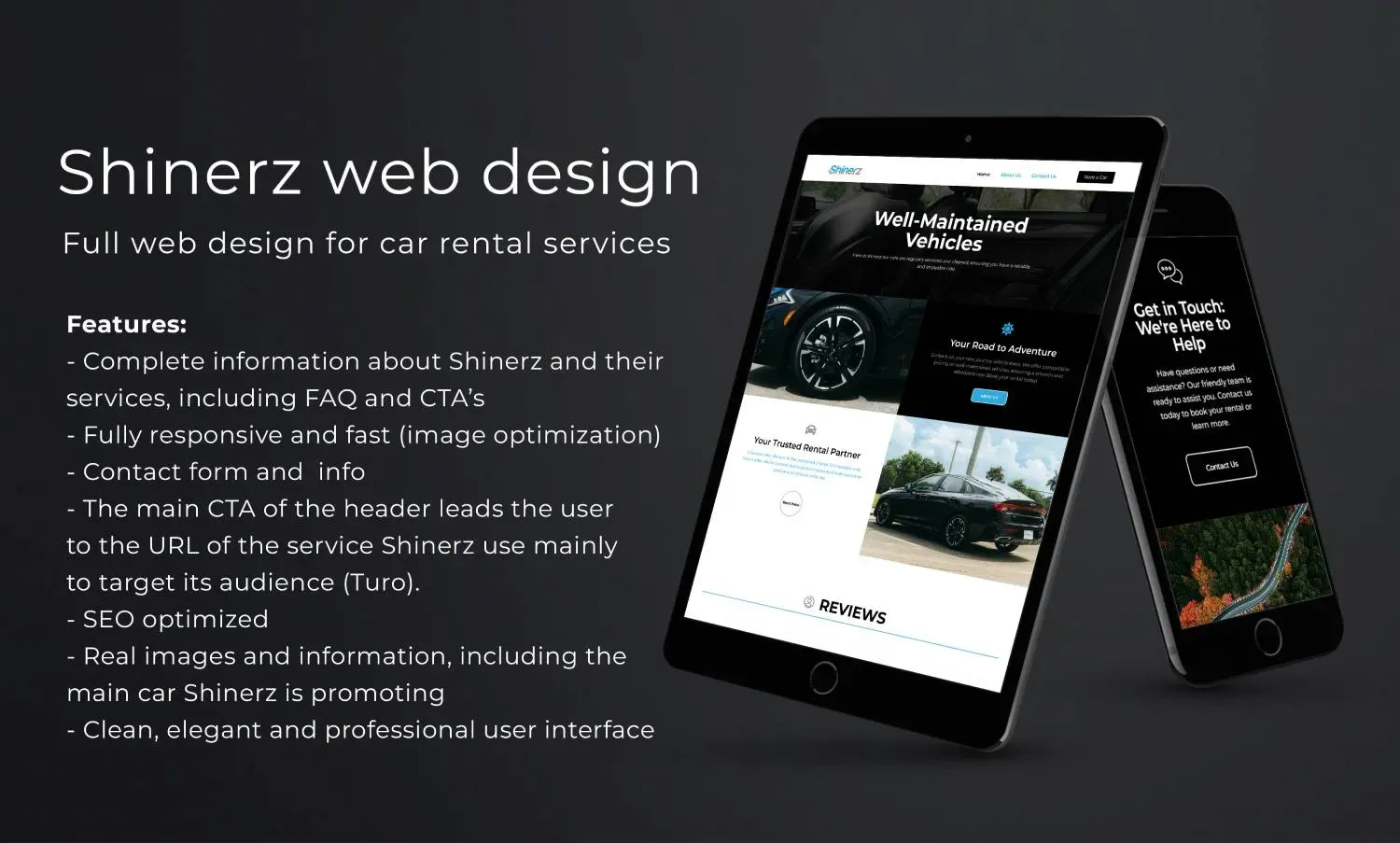
Stack
- WordPress with Elementor Pro, built on native containers with no third-party add-ons
- Vehicle imagery in WebP, sized per breakpoint
- Video in HEVC and WebM, compressed and deferred
- Semantic heading structure throughout, so the fleet categories are legible to search engines
- Turo redirection points tagged for event tracking, so the client can measure how many visitors actually reach the booking platform
Result
A site that builds desire and measures its own handoff, without the client maintaining a booking system they do not need.
Renting through a marketplace?
Building your own booking flow is not always the right call. Sometimes the better site is the one that does what the marketplace cannot, and gets out of the way for the rest.