
EdTech Dashboard Design with Gamified UX for Neurodivergent Learning
Project Gallery
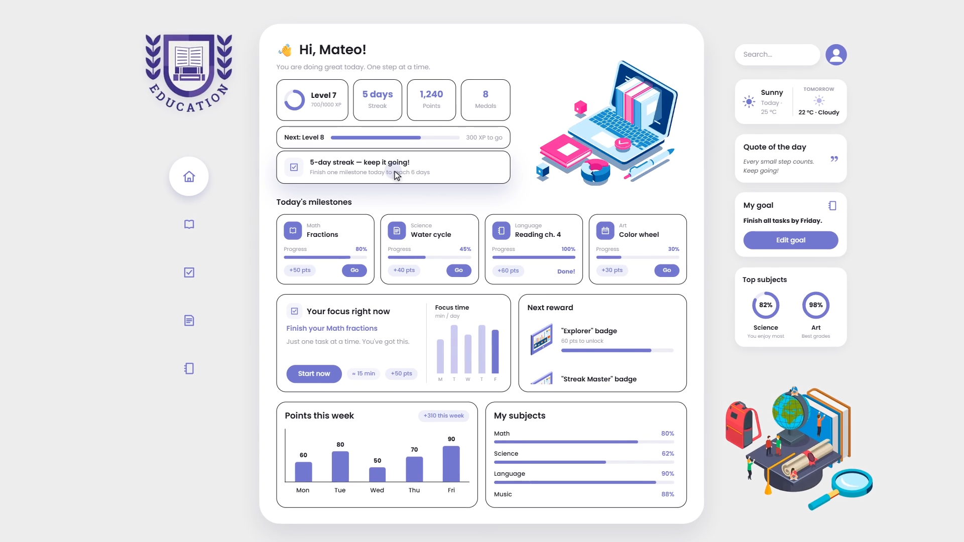
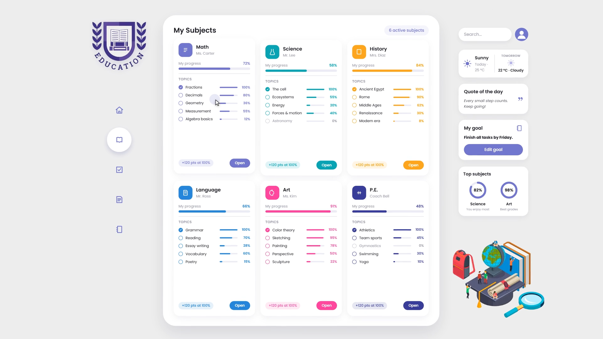
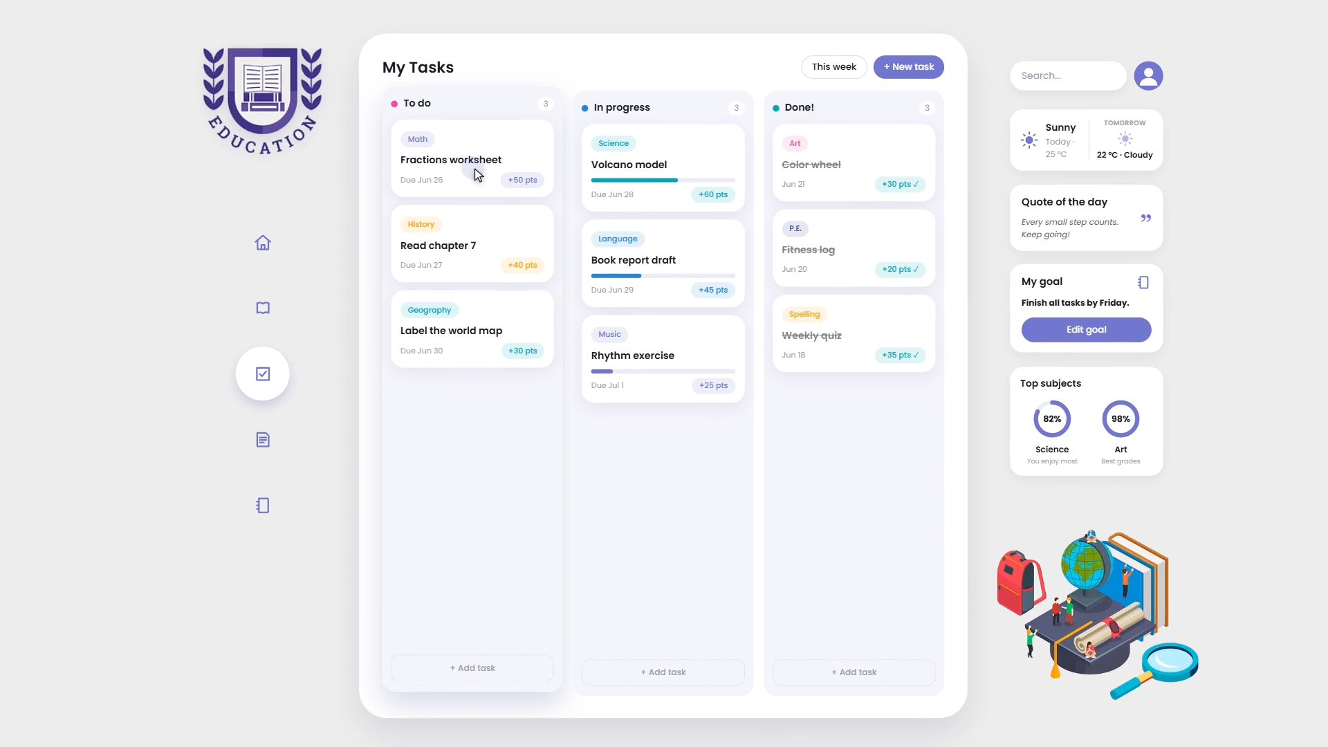
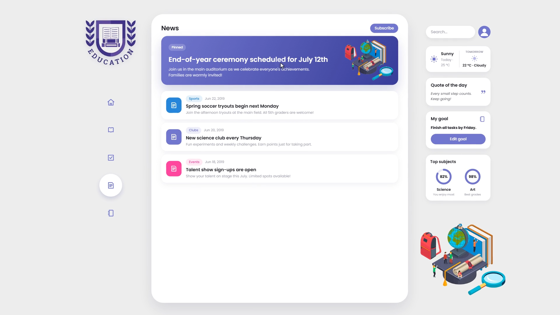
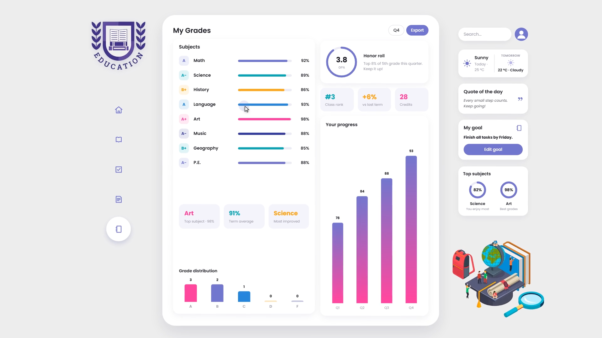
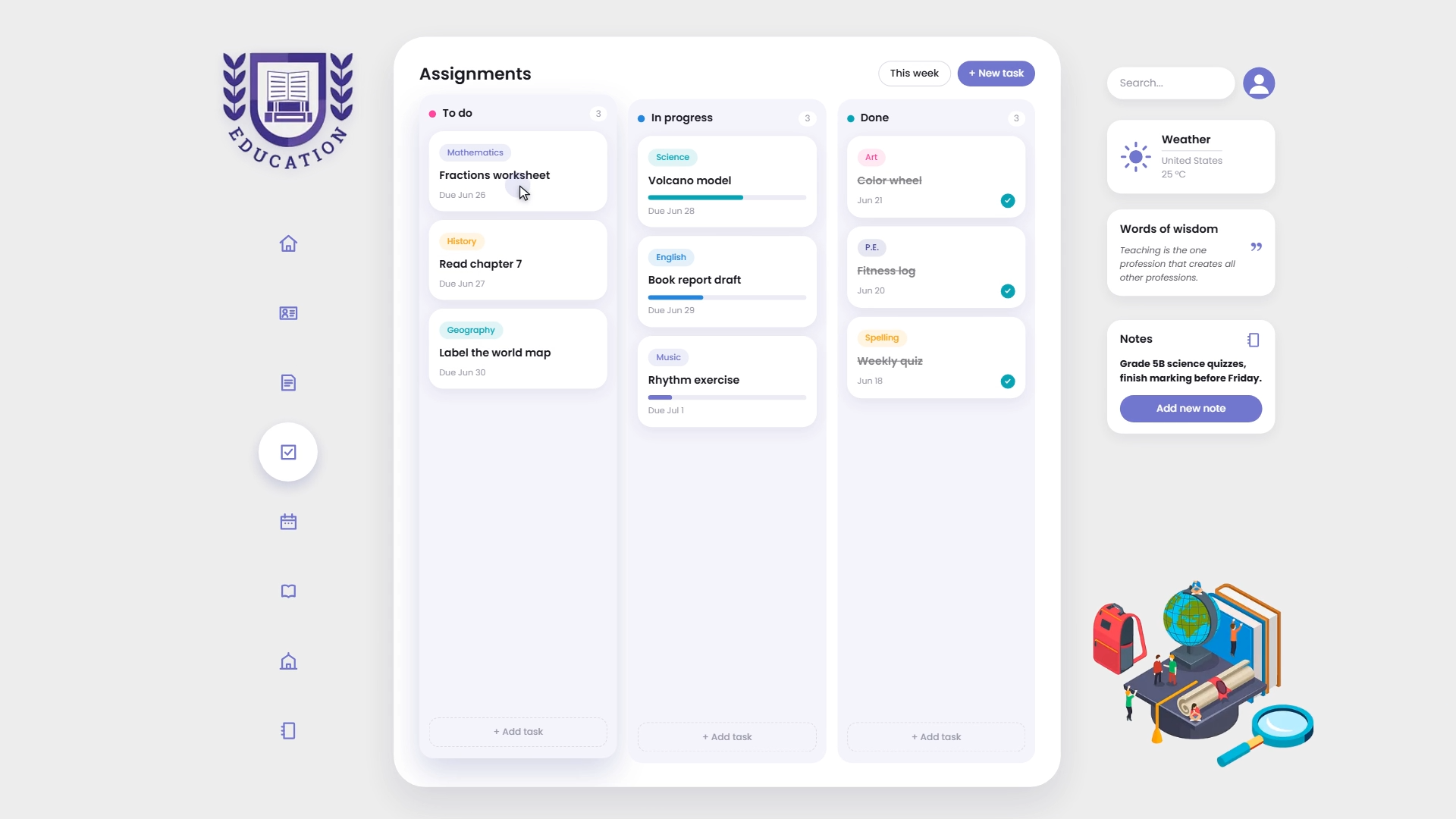
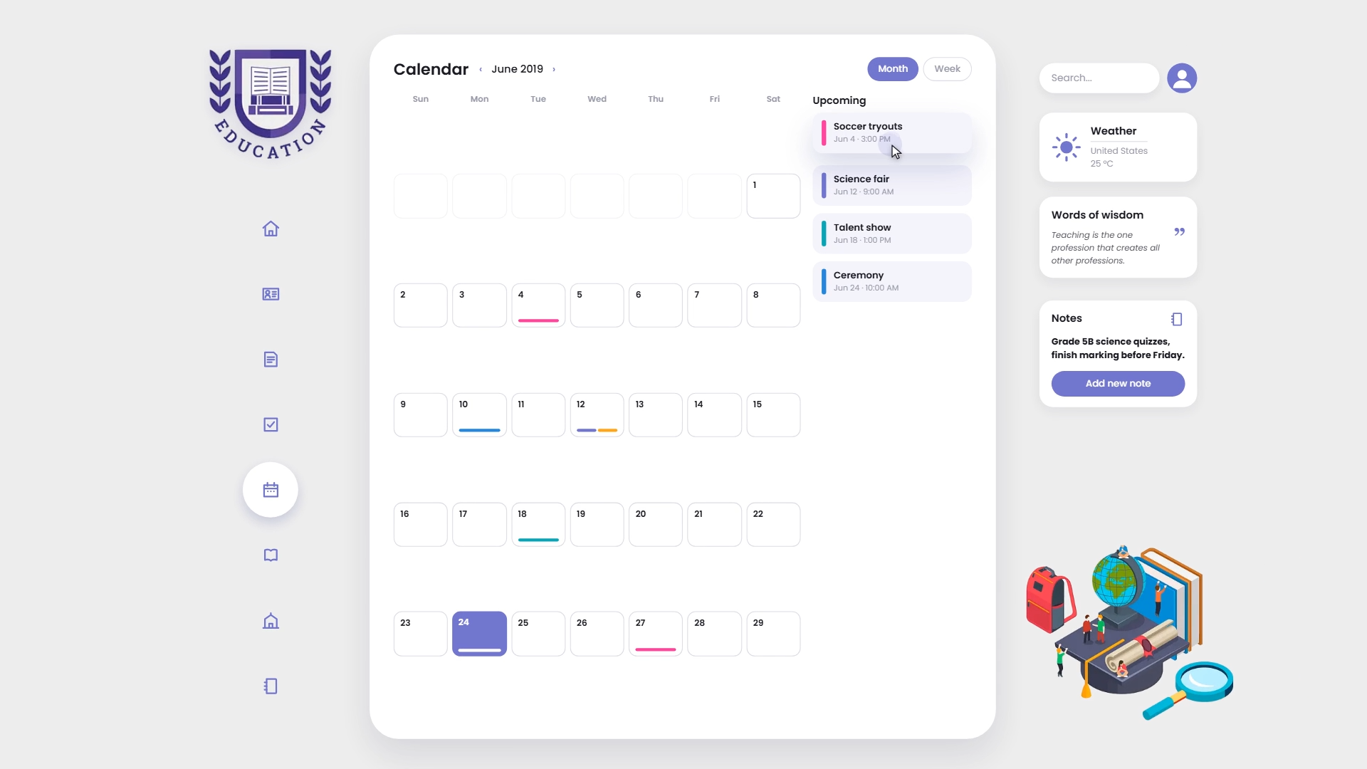
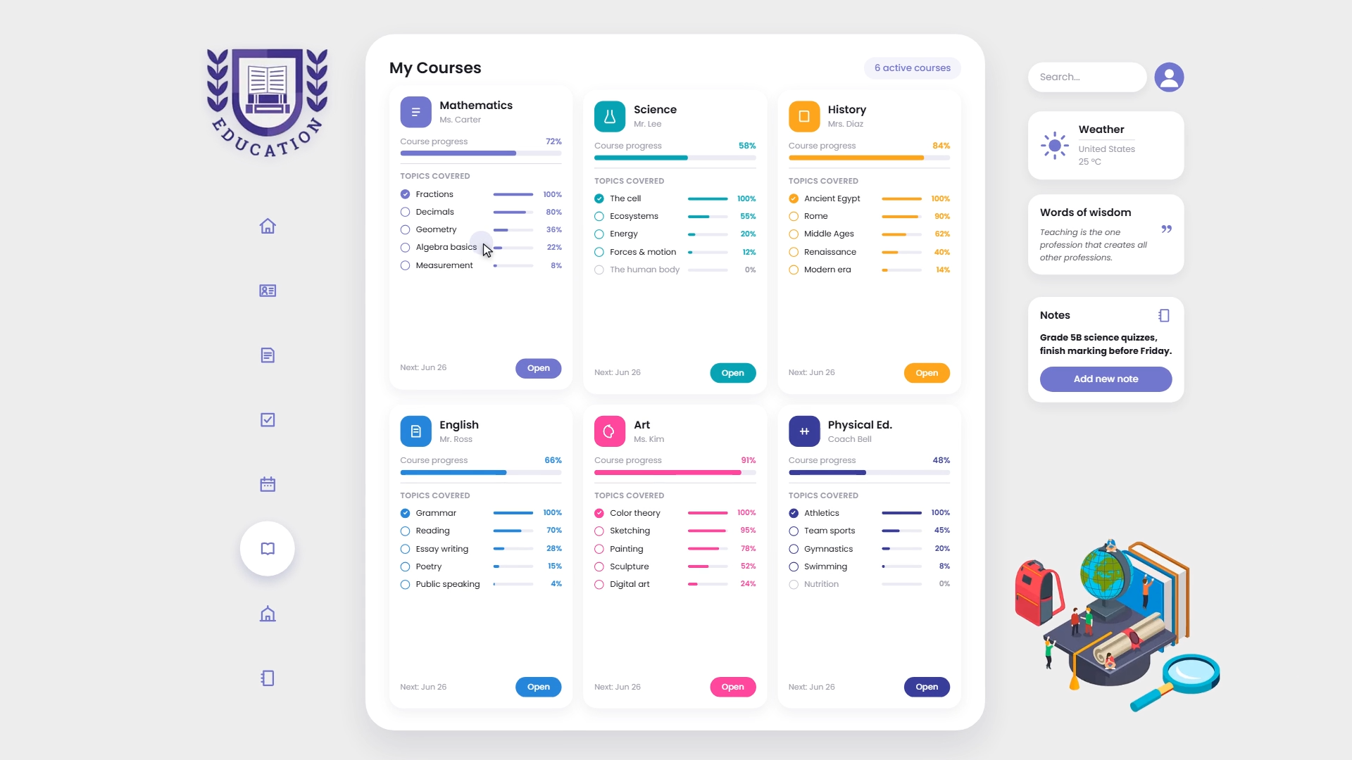
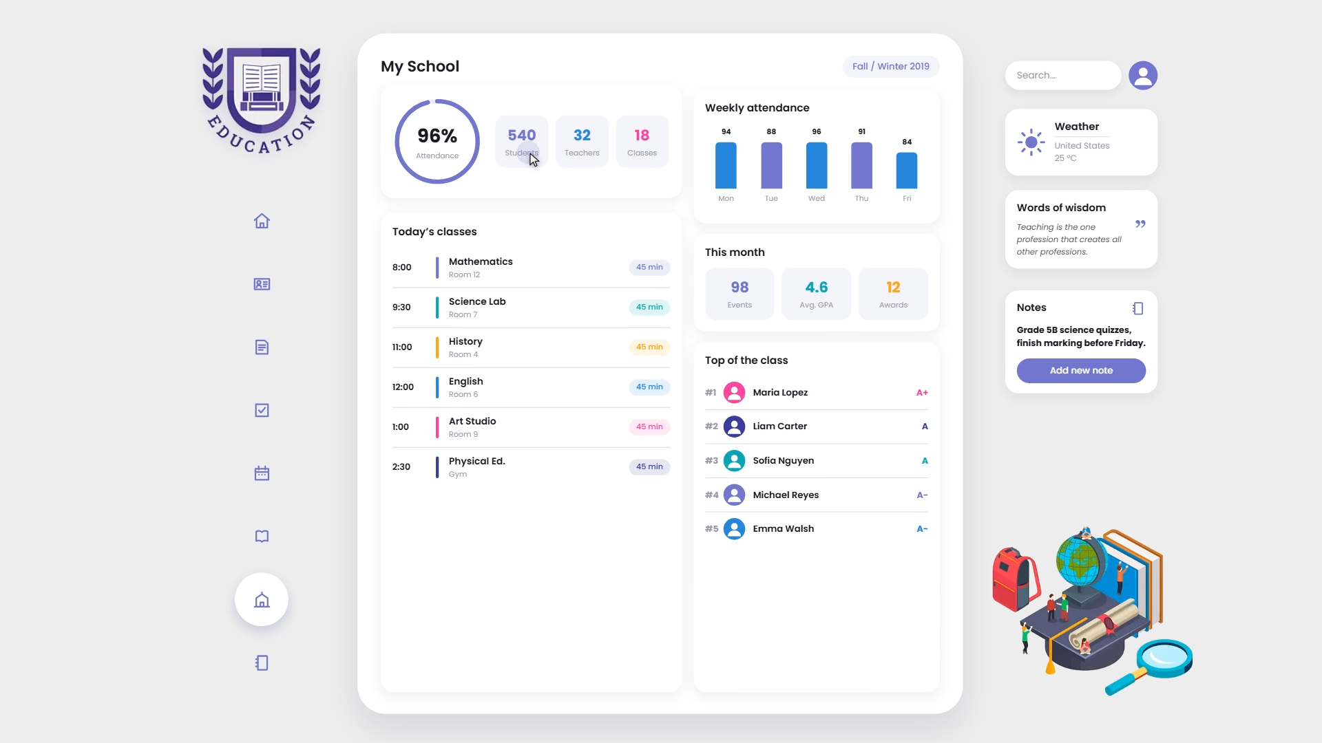
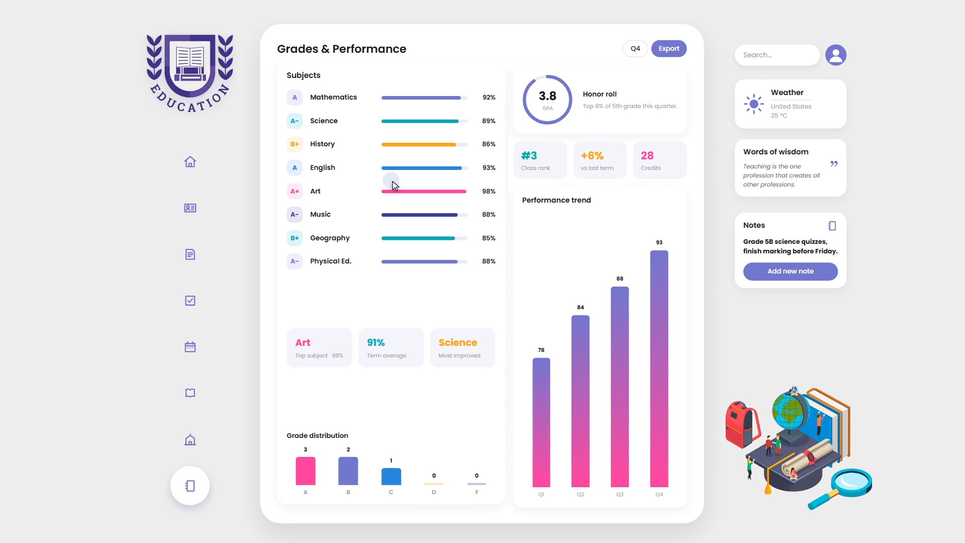
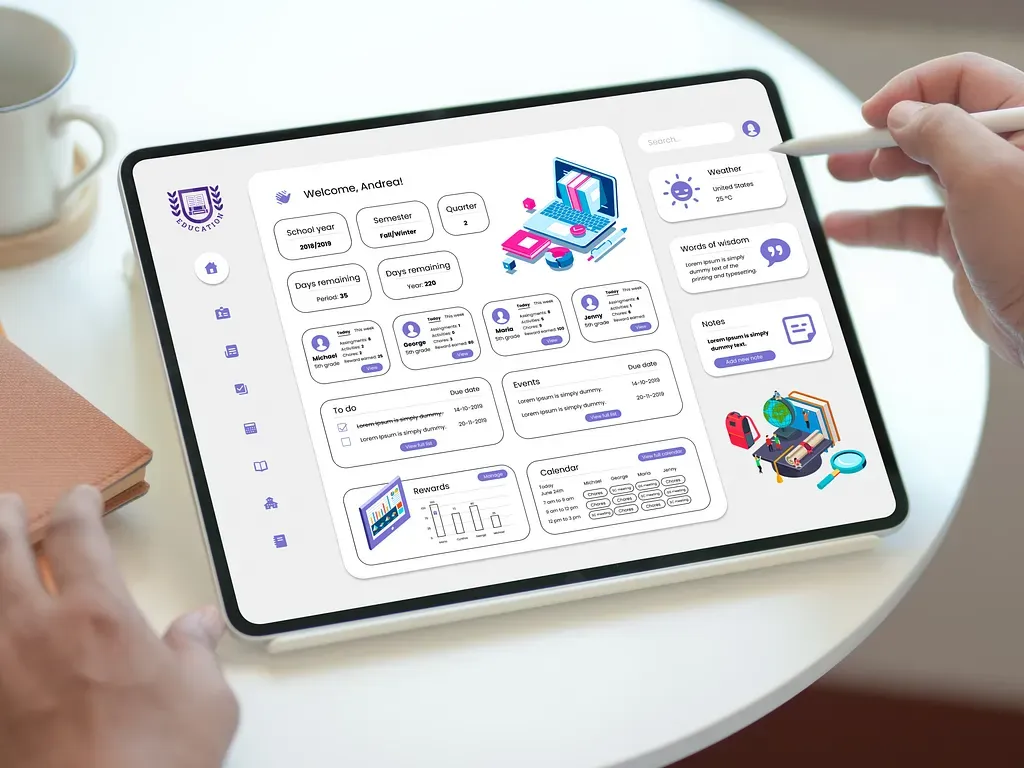
Student view
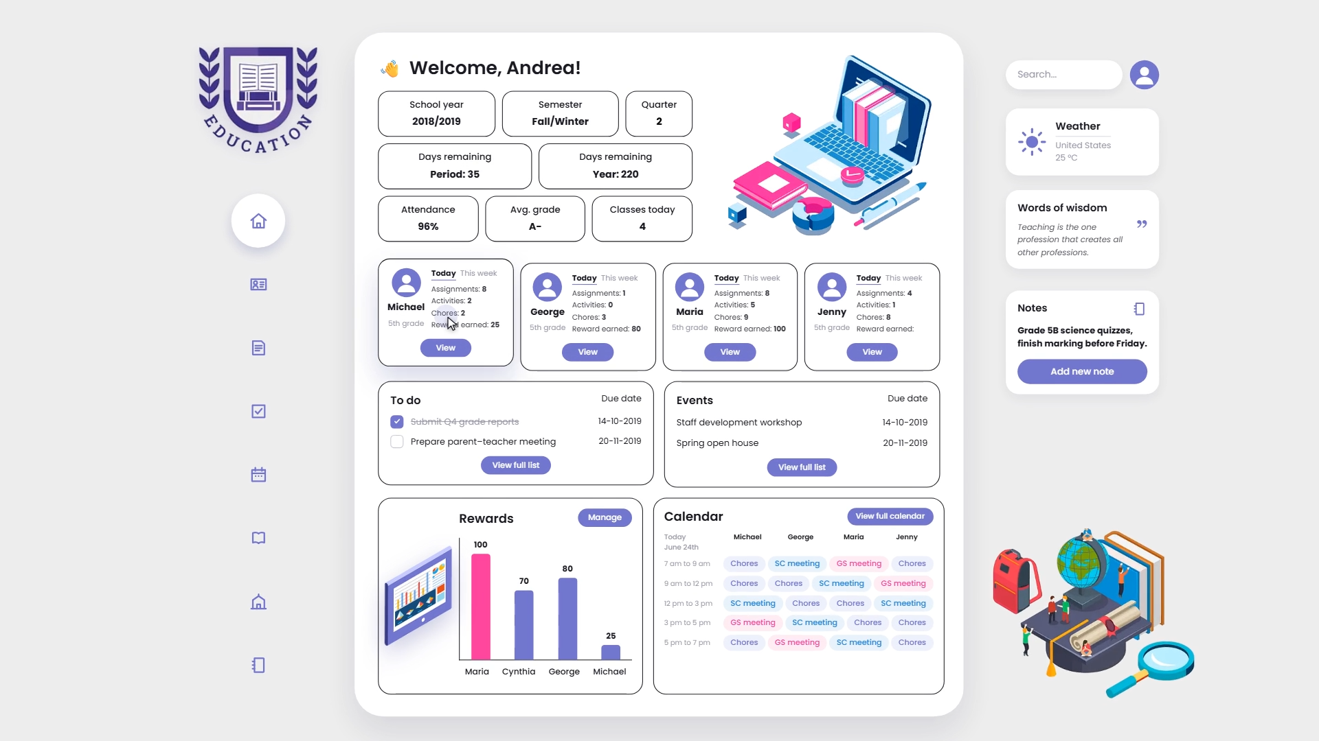
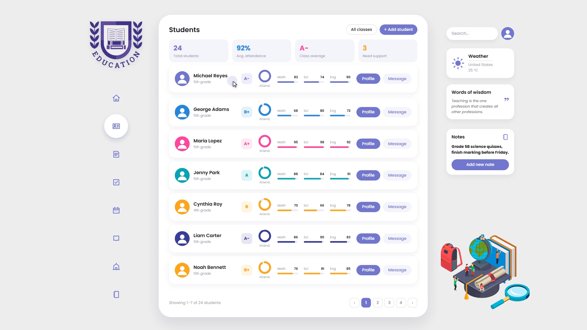
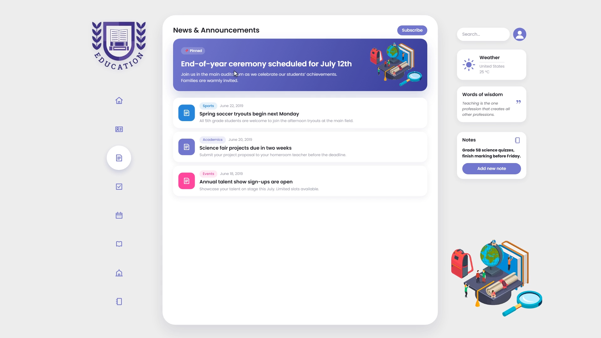
Teacher view
The premise
Most learning platforms are built for a student who can hold a long task in their head, break it down unprompted, and stay motivated without feedback. That student exists. Plenty of others do not work that way, and they are the ones who drop out of online courses.
I designed this platform around the second group, specifically around the executive function difficulties that come with ADHD. The interesting part is that almost everything that helps there also helps everyone else, which is the whole argument for universal design.
Where gamification is actually load-bearing
Points and badges get dismissed as decoration, and often they are. Here each mechanic maps to a specific difficulty:
Immediate feedback after every action. ADHD is, in practical terms, a difficulty with delayed reward. A course that pays off in three months provides nothing to work with today. Visible progress after each completed step gives the loop something to close.
Long tasks broken into visible units. A twelve-week course shown as one bar is paralysing. Shown as a sequence of small steps with a marker of where you are, it becomes something you can start. This is what gets past the wall that stops people before they begin.
A single next action per screen. Task switching is expensive. The interface shows what to do now and puts everything else one level down, so returning after an interruption does not mean re-deciding where you were.
Two products, not one with a toggle
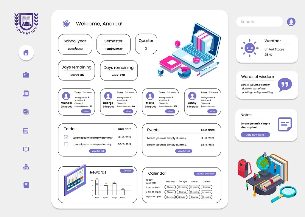
Students and teachers need opposite things from the same data, so I designed them as separate applications sharing a system.
The student dashboard is focused and quiet. Current tasks, a progress view, one clear next step. Everything not needed right now is hidden rather than collapsed.
The teacher dashboard is dense on purpose. Class-wide analytics, per-subject statistics, assignment tracking and a calendar in one place. A teacher needs comparison across thirty students, and hiding that behind navigation would make the tool slower than the spreadsheet it replaces.
Visual system
Purple as the primary colour, chosen for its association with focus rather than the alerting quality of the reds and oranges most platforms reach for. Pastel supporting tones and generous whitespace, because sensory load is a real accessibility concern for this audience, not a style preference.
Everything was built in Figma as a component library with auto layout and defined states, so the two dashboards stay consistent while differing in density.
Result
A platform where the interface does part of the work the student is expected to do alone elsewhere, and a teacher view that makes class-wide patterns visible at a glance.
Designing for accessibility
Accessibility is usually treated as contrast ratios and alt text. Cognitive accessibility is less discussed and often matters more. If you are building something people have to return to repeatedly, it is worth designing for.