
Eco-Friendly Landing Page Design
Project Gallery

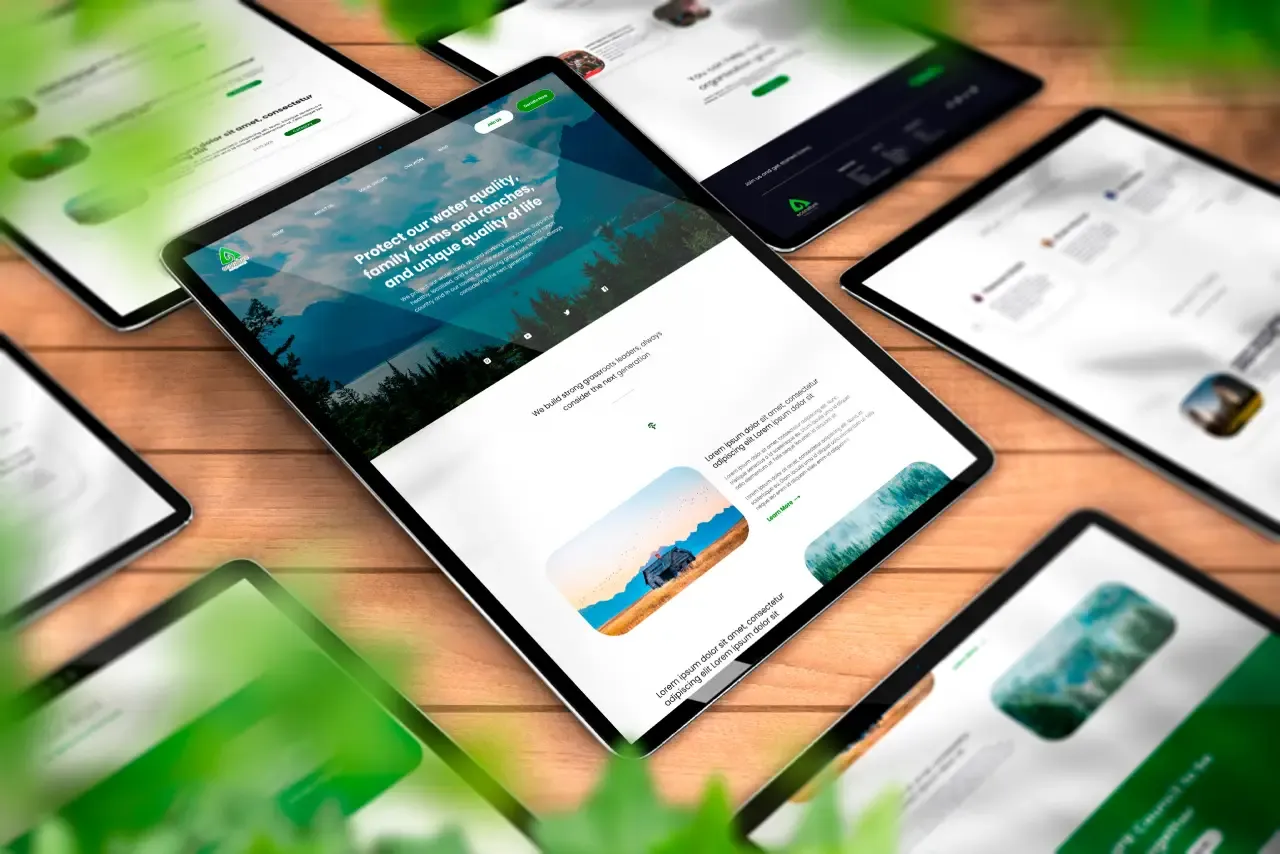
The brief
A sustainable energy company came to me with a landing page that was doing the opposite of what their brand stood for. It was dense, loud, and built around the same aggressive marketing patterns you find on any conversion template: stacked banners, competing calls to action, almost no breathing room.
Their product is about calm and long-term thinking. The page felt like a discount ad. That gap was the actual problem to solve, not the visuals.
How I approached it
I treated whitespace as the main design tool rather than a leftover. Instead of asking how much I could fit above the fold, I asked what each section had to accomplish and cut everything that did not serve it.
Three decisions carried most of the weight:
A restrained palette. Forest greens and warm neutrals, with a single accent reserved for actions. Limiting the palette meant the call to action never has to shout to be found.
A modular card system. Rather than a bespoke layout per section, I built a small set of reusable cards with soft corners and consistent padding. This gives the page depth without visual noise, and it means the client can add sections later without the design falling apart.
Typography with room to breathe. A clear type scale with generous line height, so the reading experience matches the tone the brand is selling.

Built for handoff
The whole layout was produced in Figma using components and auto layout, not as flat mockups. Every card, button and section is a reusable component with defined states, so whoever builds it gets spacing tokens and variants instead of guesswork.
I also specified the export path up front: images delivered as WebP, sized for their actual display dimensions. A page about energy efficiency that ships multi-megabyte hero images undercuts its own message, and the lighter payload is the difference between a fast page and a slow one on mobile connections.
What it delivers
The result is a page a visitor can read without effort. The hierarchy guides you from the value proposition to the solar offering to the contact form in one pass, and the component library means the brand can grow the site without commissioning a redesign every time.
Need a landing page that reflects your product?
I design and build pages that stay readable as they grow, with a component system your developers can actually use. Let’s talk about what yours needs to do.