
Cedir | E-commerce & Educational Platform Web Design
Project Gallery
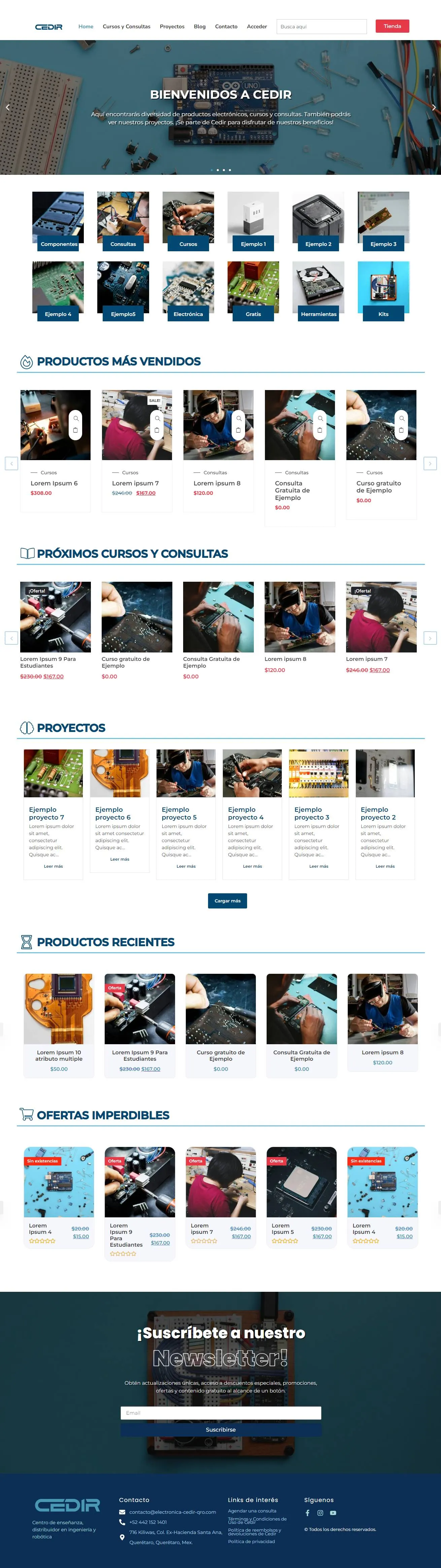

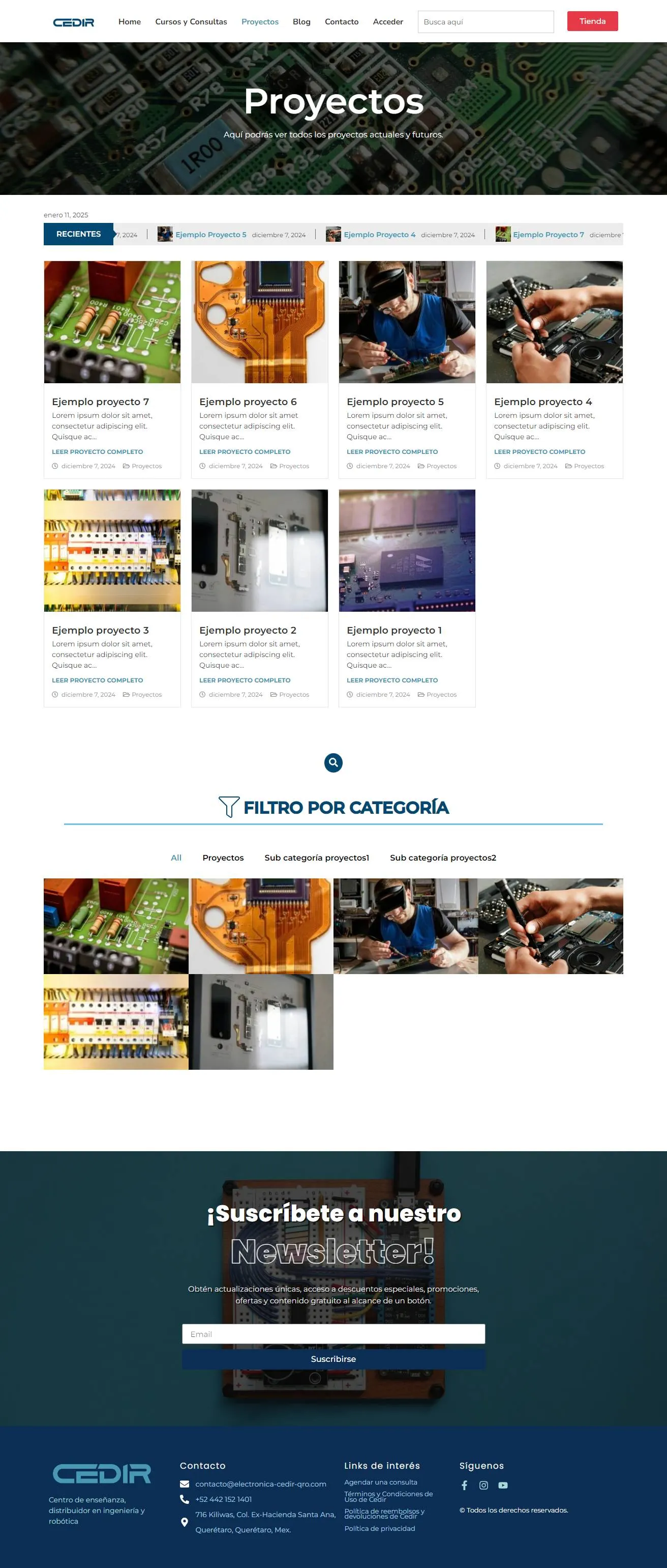
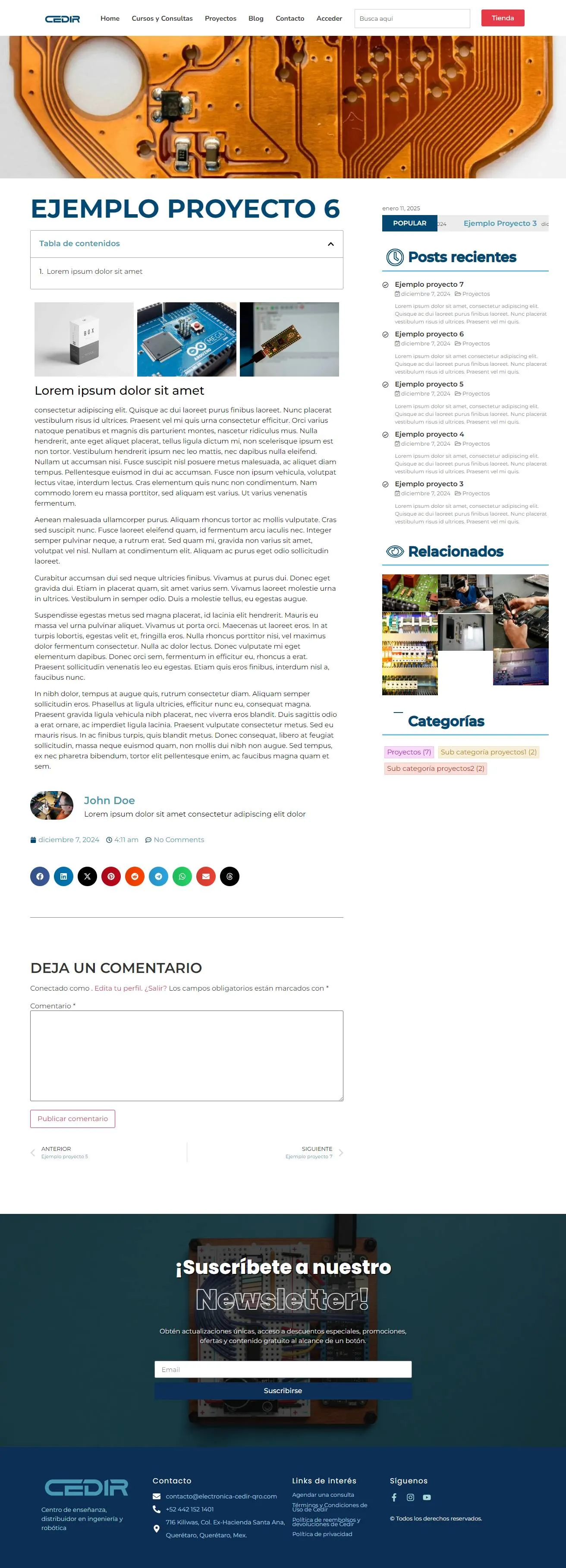
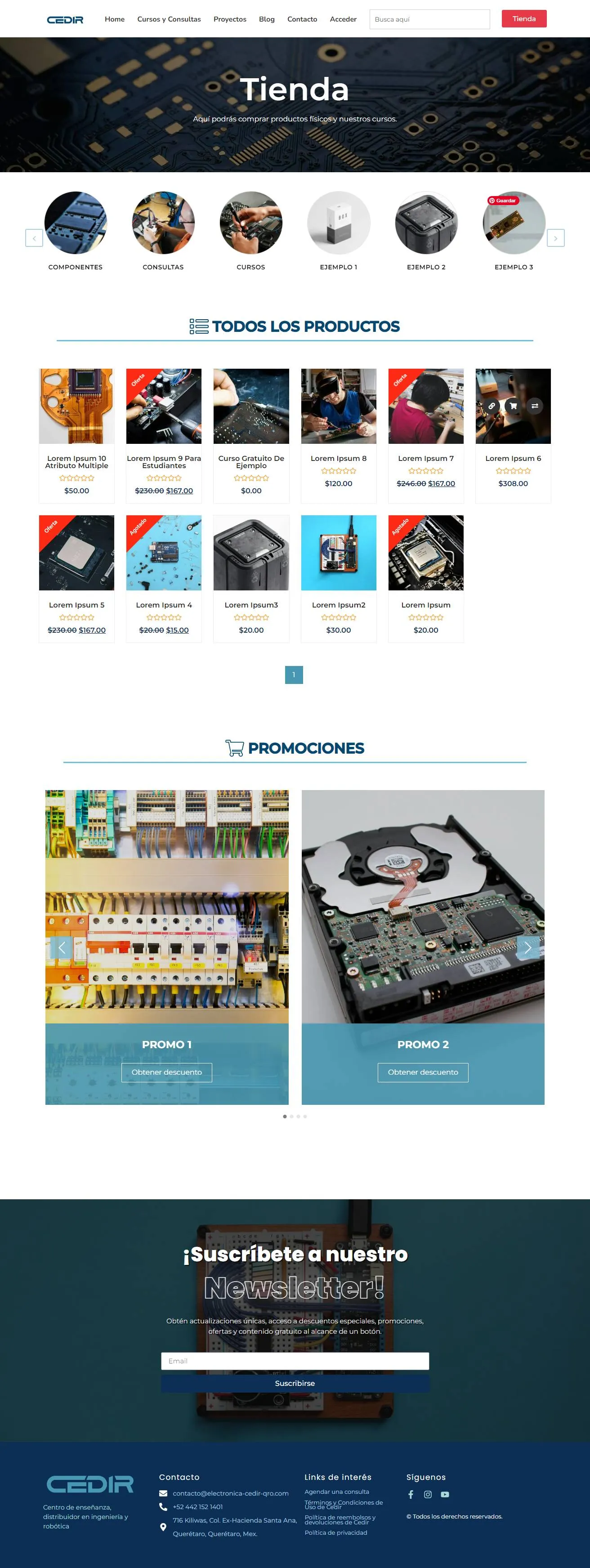
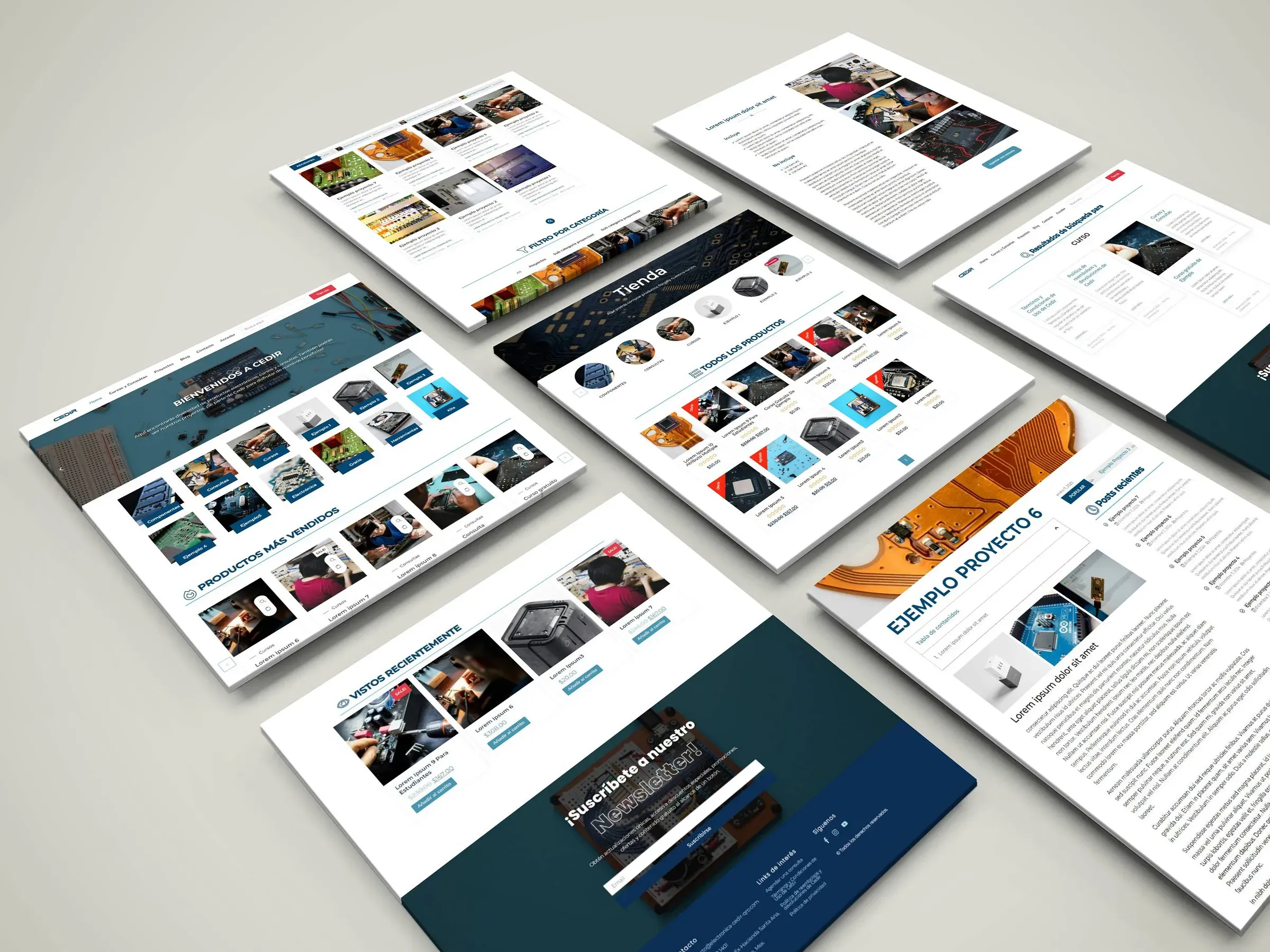
Two businesses that had to feed each other
Cedir teaches electronics engineering and sells components. Those are usually separate sites. Here they needed to be one, because the teaching is what makes someone qualified to buy the components, and the free projects are what brings them in.
The design problem was building a site where the educational content leads naturally into the store without either feeling like bait for the other.
The membership system
The core of the build is a four-tier access structure, promoted manually by the administrator rather than automatically by purchase:
- Subscriber for anyone who registers
- Enthusiast for active community members
- Student for access to the course modules
- Professional for advanced technical data and project files
Manual promotion was a deliberate choice. Automatic tiers based on spending turn a community into a paywall. Promoting people based on participation makes the levels mean something, and that is what keeps a technical community engaged rather than transactional.
Each member manages their own profile through a custom account area, so the administrator only handles the tier itself.
Features that came out of how the audience behaves
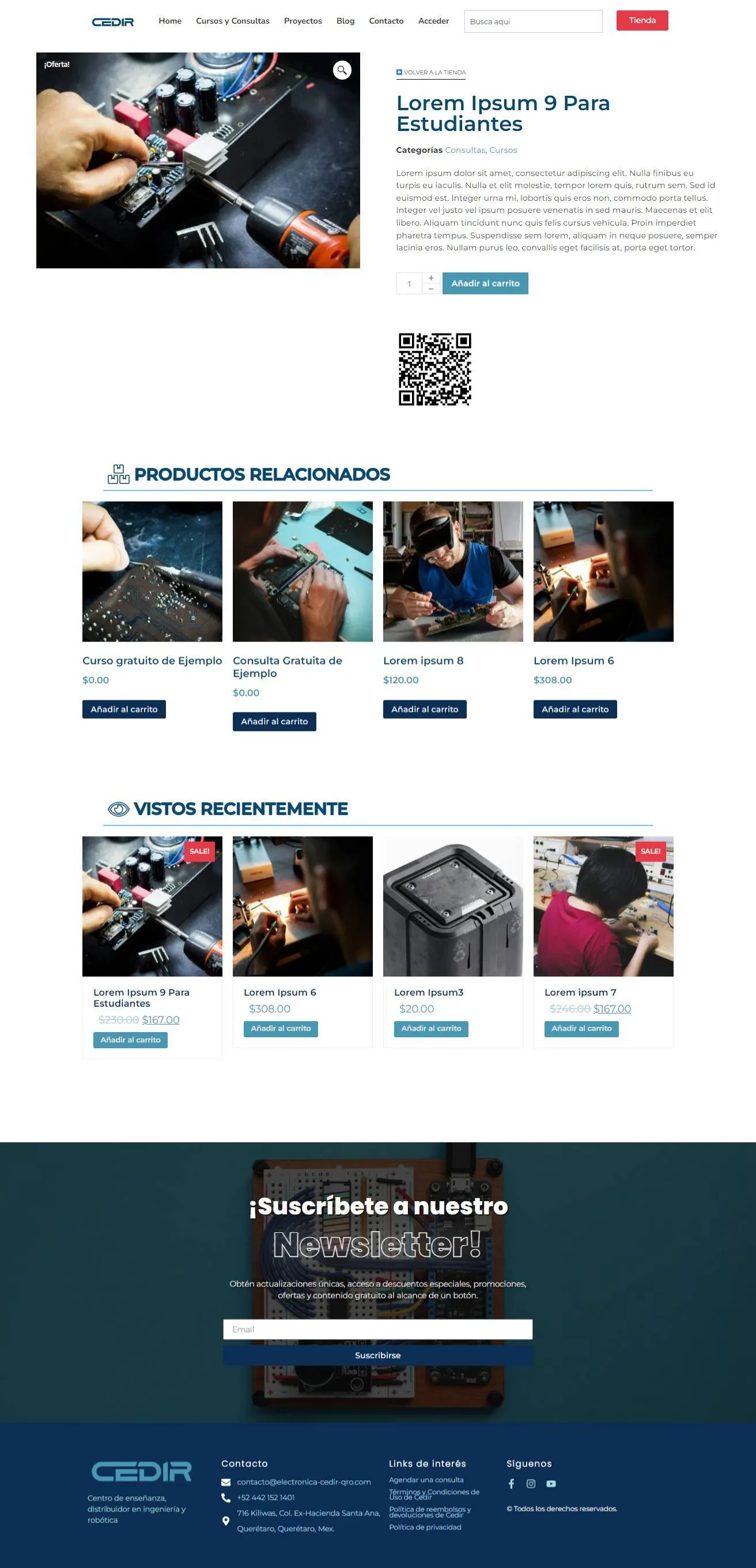
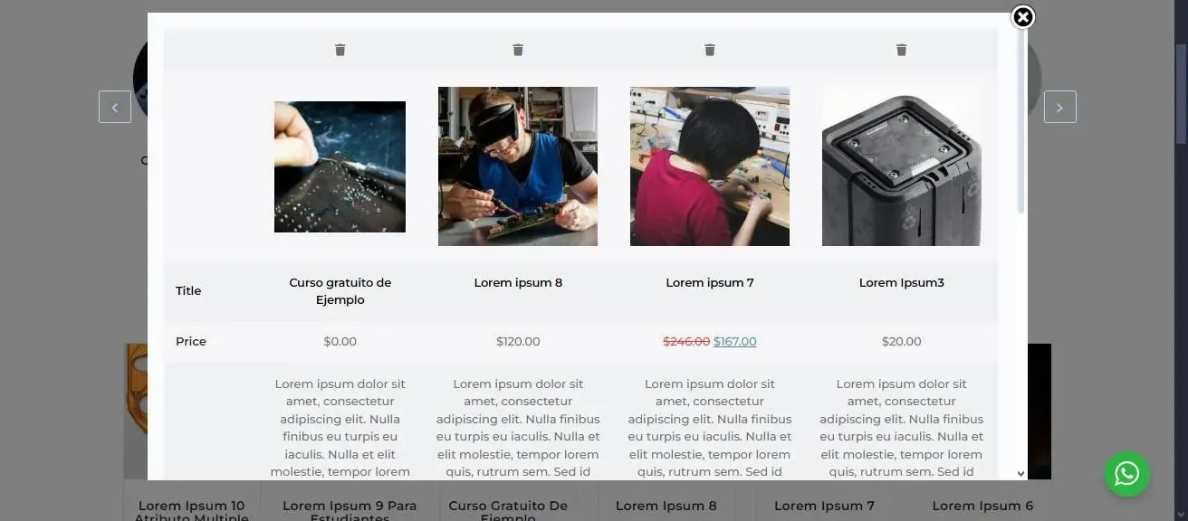
A comparison module in the store. Engineering students compare specifications before buying, which is not a habit most e-commerce templates account for.
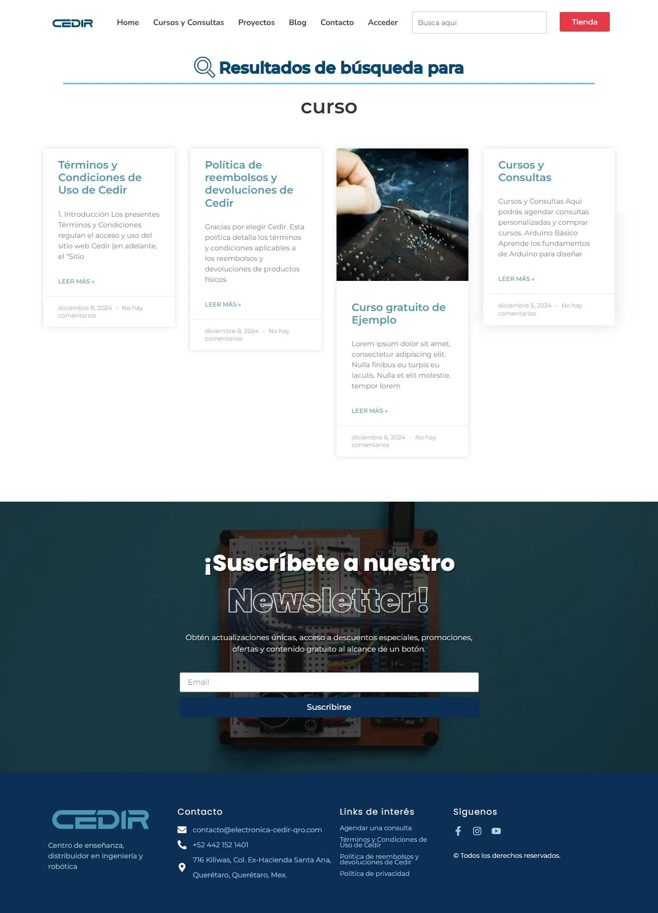
Search across the whole site. Content and products are indexed together, because someone looking for a component and someone looking for the project that uses it are often the same person.
Consultation booking embedded in the page. Calendly sits inside the site rather than linking out, so the decision to book happens where the interest was created.

WhatsApp for direct questions, because in this market that is where technical queries actually happen, and pretending otherwise costs sales.
Newsletter automation to keep contact with people who are learning but not yet buying.
The speed constraint
The client had one firm requirement: fast, with no video anywhere.
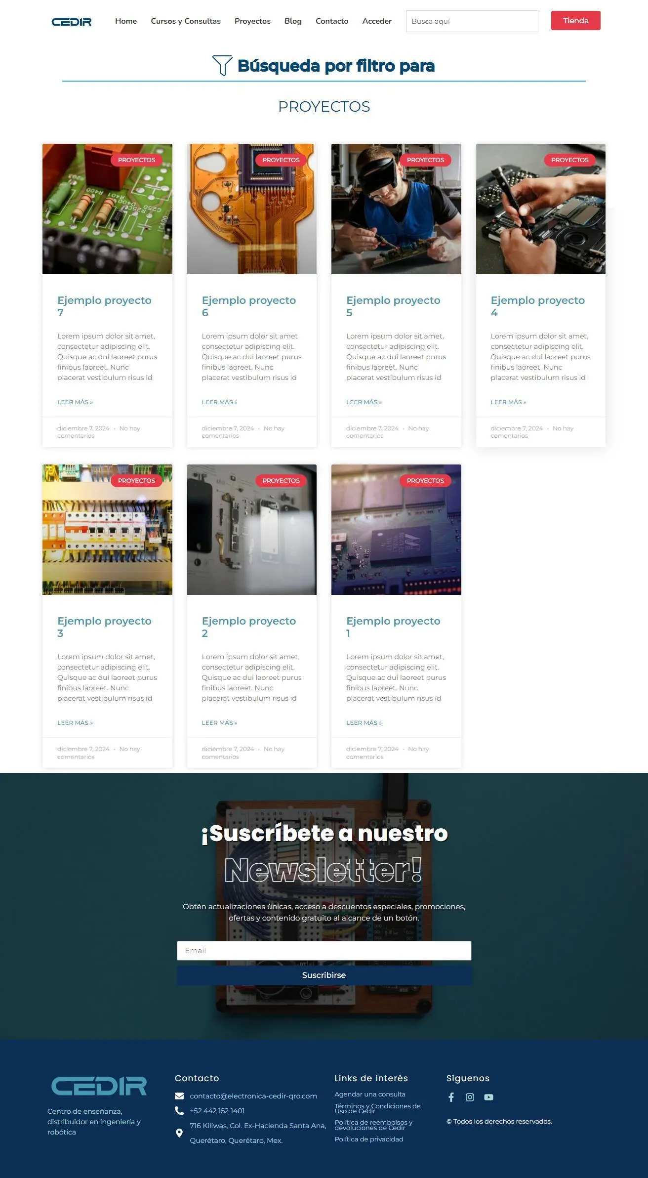
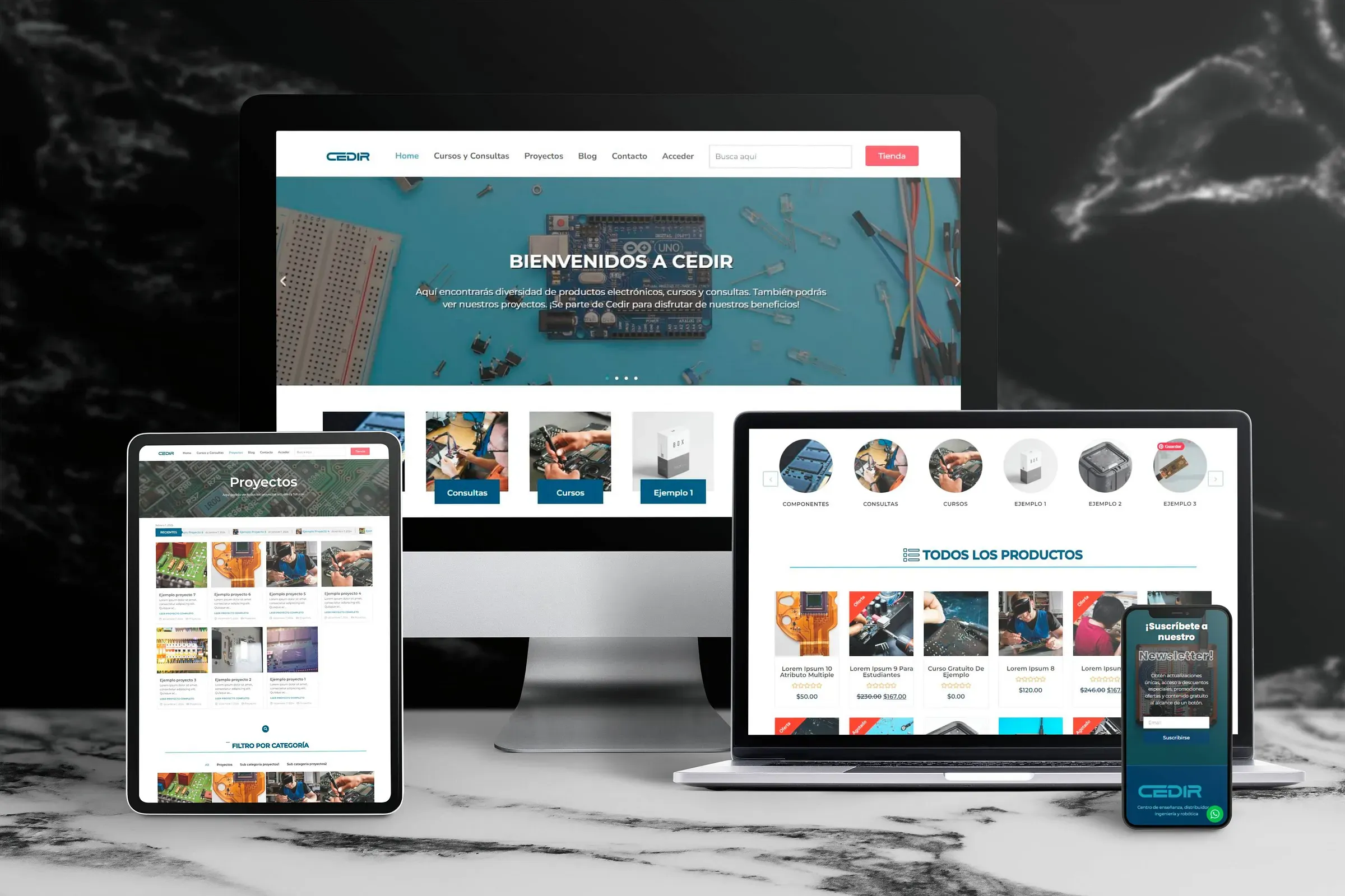
That ruled out the usual approach to making a technical site feel alive. Instead I built the movement into sliders and carousels, which let visitors move through large volumes of products and projects without the page growing endlessly, and which cost almost nothing to load.
Every image went through aggressive compression tested against its actual display size. On a site with this much catalogue, image weight is the whole performance story.

Architecture
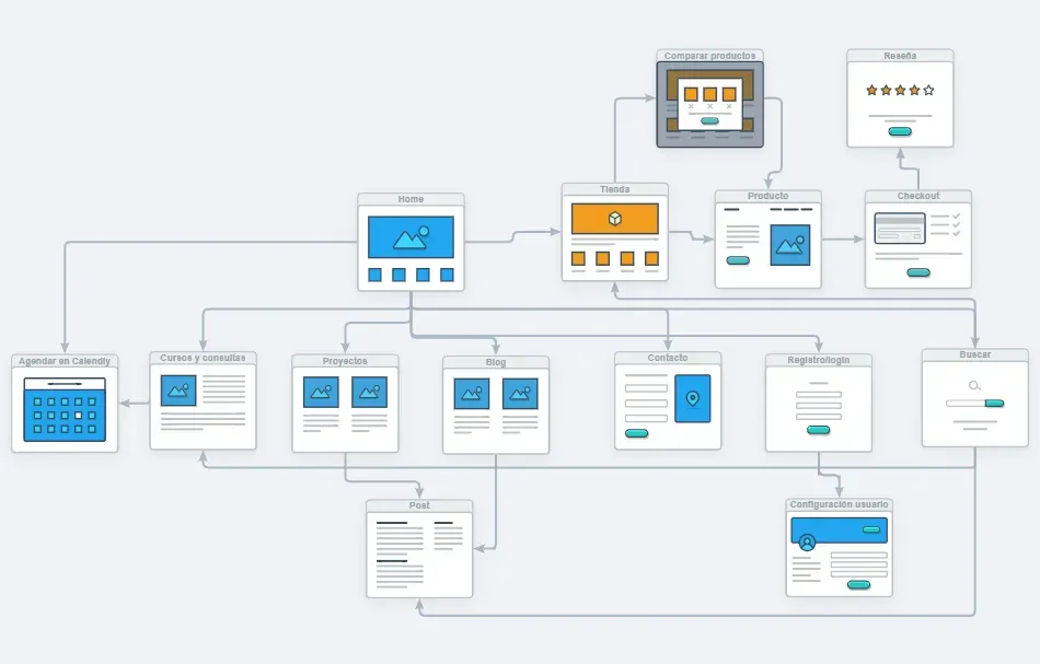
I structured the site as two silos, learning and buying, connected at deliberate points rather than merged. That separation lets search engines categorise Cedir as an authority in both areas instead of reading it as one confused site.
The typical path runs: find a free project through search, book a consultation, then buy a course or the components it needs.
Stack
WordPress with Elementor Pro using native containers, WooCommerce for the store with custom comparison logic, Mailchimp for the newsletter, and Calendly embedded for bookings. Account areas are role-gated so tier content is enforced server-side rather than hidden with CSS.
Running several things at once?
Sites that host content, courses and a store usually fail by treating them as separate sections. The value is in how they connect, and that has to be designed before anything gets built.